Nearly 75% of eCommerce website visitors put an item in their shopping cart and then leave, never to return. You will never convert 100% of your website visitors. However, simple changes can help you convert a lot more. This post will show you the questions to ask to improve your eCommerce conversion rate.
Who’s the audience?
One, if not the most, important factor to increase your eCommerce conversion rate is having a solid understanding of your audience. This means you need to know what your target audience wants and needs. By understanding how your audience thinks you are able to create the correct messages and offers that will resonate with them. If what you offer and how you present it matches their state of mind, you have gained a customer.
Conversions happen only when you show the right audience with an offer that is correct for them.
What’s the value of your product?
What is special about your product? Why should I buy this? What benefit does your product offer me? These questions are what your customers need and, what your value proposition should answer. If your product doesn’t offer value then increasing your eCommerce conversion rate is going to prove impossible.
To understand value think about a simple equation, Value = Cost of Product – Benefits Received.
What is the One Thing I can do to reduce friction?
Friction is the number one eCommerce conversion rate killer. Examples of friction: messages that are not clear, missing information or poor form design. If your visitors feel friction, those small annoyances that get in their way, you have a problem. Most eCommerce sites have a lot of friction points and yours is no different. Instead of trying to fix them all at once, find one, the most critical, and work to remove that bit of friction. Then move on to the next most critical. And so on.
“Friction = opportunity. Solve it for your customers today, or a competitor will tomorrow.” @TheGrok
How can I make the call to action stronger?
The purpose of a call to action (CTA) is to move the visitor forward–add a product to their cart, check out, register, etc. It is one of the most important elements of your eCommerce site. Sadly however, the call to action is often simply overlooked.
CTAs must clearly state what action the visitor should do. Use action words like “Add” or “Download” instead of “Continue” or “Submit.”
Make sure your CTAs standout and are easily visible. Big CTAs attract more attention and are easier to find on a page than smaller ones. In addition to size, use color to your advantage. Color can make a noticeable difference and increase your eCommerce conversion rate.
What should I do first?
The first handful of questions will give you a bunch of ideas that, when implemented, will improve eCommerce conversion rate. Often, this list of ideas becomes overwhelming. It paralyzes you with indecision.
The best place to start is with the most achievable issues that don’t require a lot of effort.
Attack the low hanging fruit first.
These questions along with the examples will get you through the indecision and well on your way to improving your eCommerce conversion rate.
Is the Value Proposition Obvious?
As touched on above, without value, increasing your eCommerce conversion rate will be an uphill battle. The value proposition should answer the question ‘Why should I buy from you’.
Examples:

Williams-Sonoma’s value proposition, “Inspiring Cooks Everywhere,” is aspirational in nature. It tells the visitor that yes, they can make gourmet food too.

A value proposition that clearly indicates why a customer should buy from Lululemon.
Both of these examples communicate why a visitor should buy from each brand. They show how a good value proposition helps improve eCommerce conversion rates.
Are Your Headlines Clear & Compelling?
Your headline is the most important piece of copy on your page – its job, stop visitors in their tracks. Often your headline is one of the first things that a visitor reads after landing on your site.
On the average, five times as many people read the headlines as read the body copy. David Ogilvy
Example:

Under Armour makes a strong statement with their hunting boots headline.
Are Your Product Images Professional & Motivating?
High quality images should excite the visitor and make them believe they cannot live without your product. Images are critical to a positive buying experience and without this your eCommerce conversion rates will suffer.
Example:
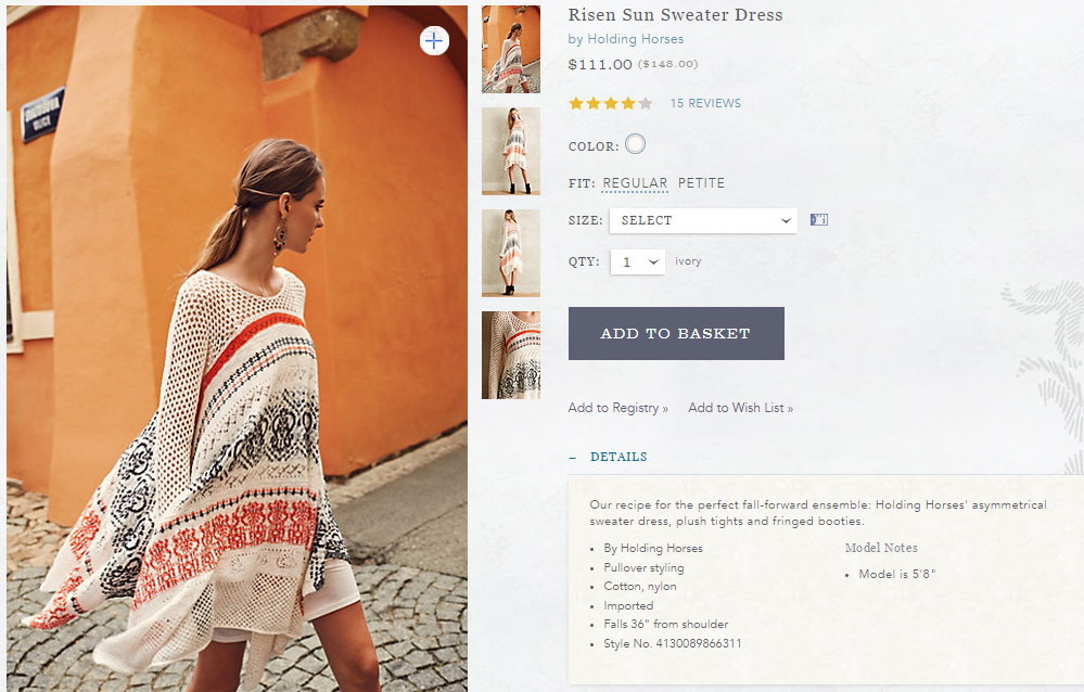
Anthropologie has large, high quality images that show different angles of the dress.
Are Benefits Focused on the Visitors?
Visitors want to know what the product will do for them. Speak to a visitor’s emotional needs. In the example below having restaurant-perfect and attractive round shaped poached eggs doesn’t make the eggs taste better. What those things do is make whomever is cooking the eggs feel like a professional chef.
People don’t want to buy a quarter-inch drill; they want to buy a quarter-inch hole. Theodore Levitt
Example:

William-Sonoma talks about the benefits of using the egg poaching cups. “Making restaurant-perfect poached eggs (Benefit) is simple with this clever cookware. Its customized cups bring eggs in direct contact with simmering water, so they cook uniformly while maintaining an attractive round shape (Benefit) .”
Are the Testimonials Genuine?
A mix of positive and negative reviews helps to improve consumer trust and improves the eCommerce conversion rate. If all the reviews are overwhelmingly positive and glowing it comes across as inauthentic.
Example:
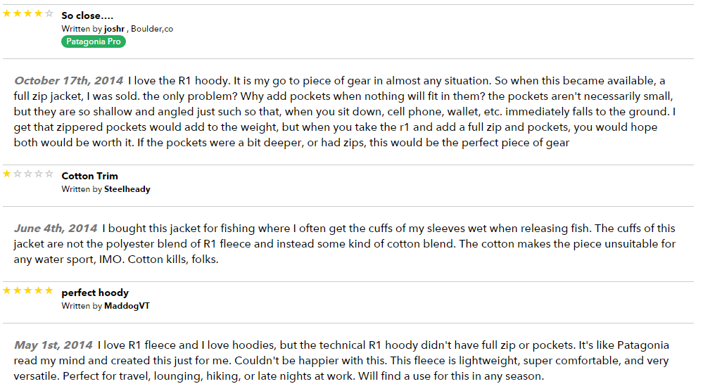
Patagonia doesn’t hide bad reviews. The mix of reviews shows they’re authentic, which improves the trust of the rest of the positive reviews.
Is the Call To Action Obvious?
The call to action must be nice and clear; and stand out from other elements on the page. The CTA should leave no doubt in your visitor’s mind what they need to do to make a purchase.
Example:

The hot pink CTA that Lululemon has chosen really stands out against the grey background.
The Right Questions to Improve Your eCommerce Conversion Rate
eCommerce conversion has a very simple goal: make more money by improving your eCommerce conversion rates. There are plenty of ways to do this but it all begins with asking the right questions. It is my hope that the questions outlined above help you improve your eCommerce conversion rate.
In case you didn’t read the whole article (I get it, I skim too) checkout my presentation, 11 Questions You Need to Answer to Improve Your Conversion Rate for a shortened, visual version.