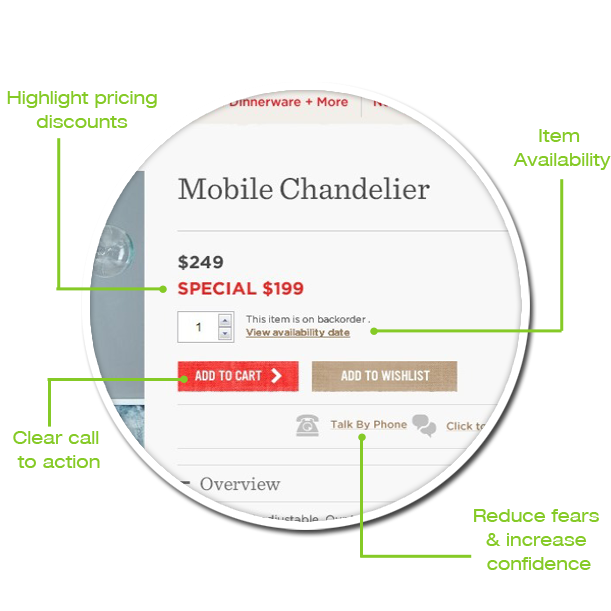
Ideas & Best Practices on How to Maximize Conversion Rates by Improving Your Product Page.
What is a Product Page
What is a Product Page you may ask? Well, boiling it down to the basics, a product page is where visitors learn about a specific product and have the ability to add it to their shopping cart.
A product page will include images, price, description, and a Call to Action (CTA) usually being an “Add to Cart” button.
Product Page Goals
The goal of the product page is to give visitors enough information so they can make a confident buying decision and complete their purchase. The page should answer questions like: “Is this the right product for me?” and “What action can I take next?”
It’s important the product page work to eliminate uncertainties and doubts about the purchasing decision. For example, “Is it possible to return this item?” or “Am, I buying the right item?”
Product pages are the most important pages on a website.
Product Page Anatomy
Below are the key elements that visitors expect to see before making a purchase decision. They add credibility and provide confidence reducing fears, uncertainties and doubts and are a must for any product page.
Essentials
Images
Title
Price
Add to Cart Button
Product Description
Sizing Information
Shipping Options
Increase Trust Factors
Nice to Haves
Product Demo Videos
360 Views
Show Similar Products
Use Emotional Triggers
– Breaking Down the Essentials of the Product Page –
Page Layout
Page layout and hierarchy are important factors to get right on the product page. Conversion happens when all of the elements on the product page work together in a logical fashion.
If the product page has the key elements but they are not easily seen than in the visitor’s eyes they aren’t there. Making visitors search to find information is a quick way to frustration.
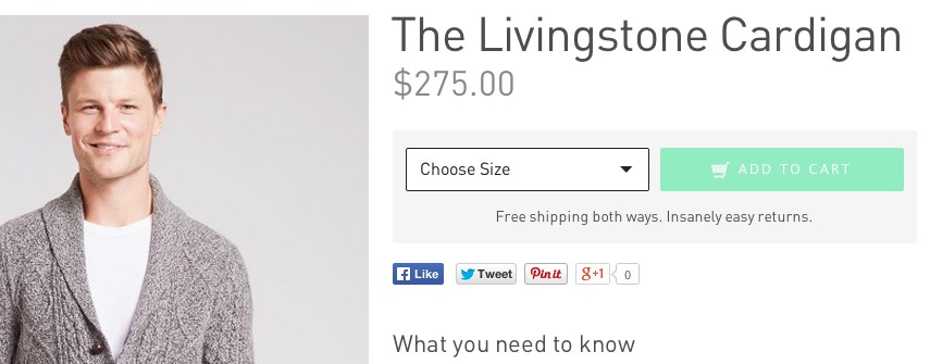
Bonobos’s product page has a large title, prominent placement of the price and they closely tied together the size selector and the call to action. They also include trust factors at the point of action (Free shipping…).
Images
The image on your product page should be the star of the show. This makes sense considering the product image is, arguably, the most important part of the decision making process. High quality images should excite the visitor and make them believe they cannot live without your product.
Because the visitor cannot physical touch and feel the item they must be able to get a sense of the product by using images only. This is especially important for fashion retailers.
When possible, showing images in context will go a long way to reduce the fears and doubts. Showing images in context will give visitors a sense of scale and how the product works. In some cases showing images in context can inspire visitors to use the product in a way in which they haven’t thought about before. This helps nudge them towards purchase.
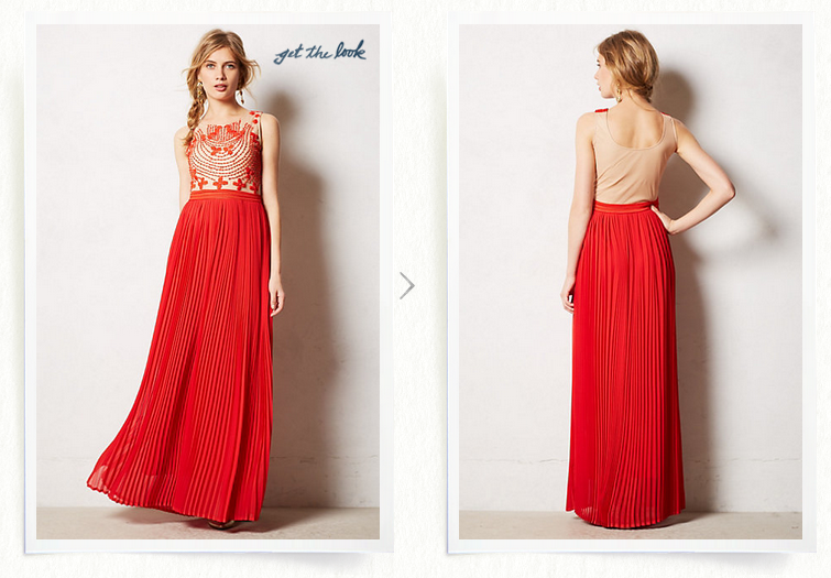
Anthropology’s product page has large, high quality images that show different angles of the dress.
Including multiple images that show the product at different angles is important for most products. Images at different angles provide the visitor with information that helps them make a buying decision.
92.6% of online shoppers believe visuals are the top influential factor affecting a purchase decision
The Psychology of Online Checkout, GetElastic
Product Zoom
Features like zoom give visitors the ability to see the finer details on a specific product.
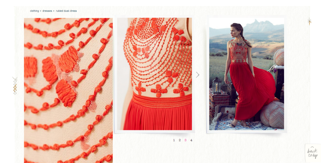
The Zoom feature on Anthropology’s product page makes it easy to see the embroidery details of the.
360 Views
Using 360 views is an easy way for the visitor to see all of a particular item rather then clicking on various images. Producing the 360 views can be difficult, costly and time-consuming. However, this may be a worthwhile tradeoff since these views will increase your conversion rate.
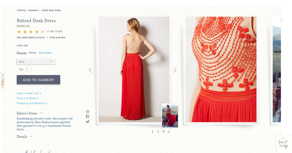
Anthropology product page has multiple images with a small preview.
Title & Price
Title
The product page title is fairly straightforward but has a couple of key purposes. One, it clearly sets the visitor’s expectations and indicates that they are in the right spot. Two, used correctly (as an H1 tag), the product title will help search engines index the product page making it easier for visitors to find what they are looking for.
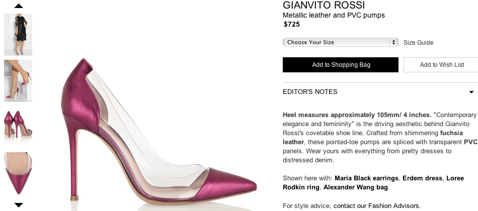
Net-a-Porter’s product page includes the price right below the title, brief description, size selector and add to bag button allowing for an easy eye scan from title down to the CTA.
Price
Obviously price has to be on the product page as it is one of main factors in whether the visitor purchases. Knowing this, the price should be shown in a prominent location that is located near the CTA. When the visitor scans over the page, their eyes will naturally flow through the product name, towards the price, and finally to the CTA. Information scattered around the product page puts the visitor in limbo.
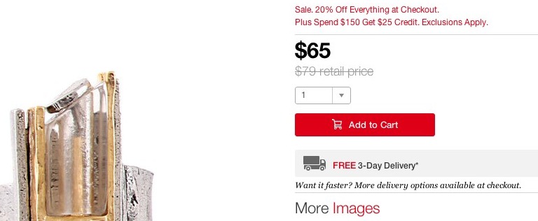
Fab’s product page feature the price in large text that is highly visible, leading the visitor’s eye towards the CTA which standouts out on the white background.
Discounts
When you offer discounts make sure to show the visitor the differences. Always showing the actual price compared to the discounted price. Reinforce the price messaging by showing the visitor the percentage saved. Solidify that the items are a good value by not making the visitor calculate the savings in their head. Don’t give the visitor the slightest reason to leave your site to check out prices at other stores.
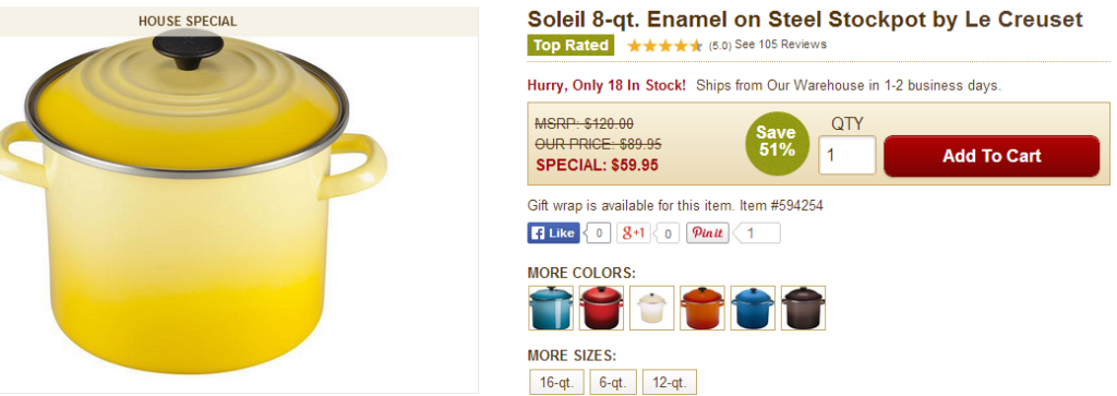
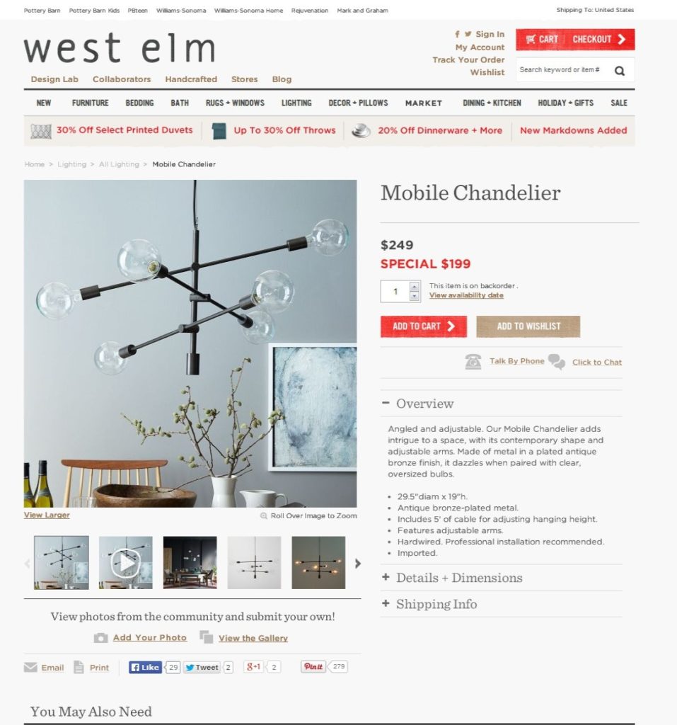
Cooking.com’s product page shows the original price, the marked down price, the special price and the percentage off making it very easy for the visitor to understand the value of the sale.
Product Description
Product descriptions must paint a vivid picture for visitors since they are not able to physical handle the item. The copy should be persuasive and informative. The more expensive the item on the product page the harder the description will need to work.
The job of the product description is to highlight the key features, benefits and any specifications.
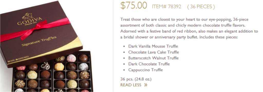
The product description on Godiva’s product page gives key information and entices the visitor to add the item to their cart.
Think about what a visitor needs to make an informed decision and then write the product description to clearly communicate this information. Provide enough detail to address key concerns.
Remember that while the product description is important, visitors do not want to be hammered with text. A dense block of copy is off-putting and difficult to understand. Utilize short sentences, bulleted lists and spacing to allow for scanning an easier reading.
When presenting product specifications it can be challenging to not overwhelm a visitor. Pay special attention to how the information is being presented making sure that it accessible and easy to read. Where possible, consider using tables and charts.
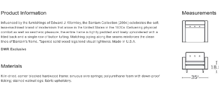
Since the dimensions are somewhat difficult to envision, Design Within Reach visually shows product details on its product page.
Provide your visitors with the information they need to make a decision. Help them understand the tradeoffs that they will need to make.
Product Video
While photos are a must, videos can be more effective to show off a product. Video is becoming more common online and does a lot to increase buyer confidence.
Using videos enables visitors to see more angles of the product, see it in context or see a demo of the product to better understand how to use the product.
Video has been shown to increase conversion rates, as well as, reduce returns since, after viewing, visitors have better idea of the product they are interested in buying.
57% of online shoppers have more confidence in purchasing a product after viewing product video.
The Psychology of Online Checkout, GetElastic
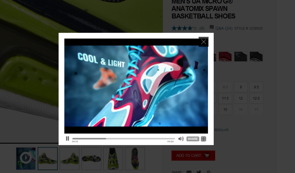
Video on Under Armour’s product page highlights the products features to get visitors excited about buying.
Call To Action
The Call to Action (CTA) must be nice and clear; different from other elements on the page. This makes it easy for visitors to understand the next step needed to complete the purchase.
One of the easiest ways to make your CTA stand out is with color. The color must stand out from background and should contrast with the rest of the colors on your site. However, be aware of what color can suggest to the visitor. For example, using red may stand out however; this color is commonly used in showing errors and can be associated with danger or to suggest stopping.
For products requiring additional information to be selected prior to adding to cart, for example size and color, make sure these actions are located close to the CTA so the visitor can efficiently make their selections and move on.
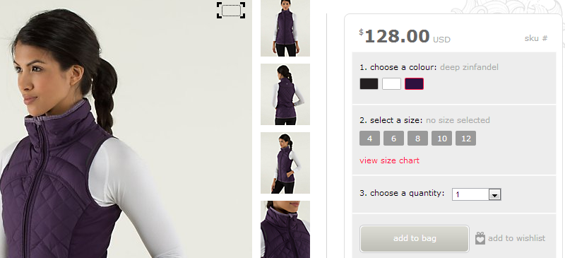
The hierarchy on Lululemon’s Call to Action is well done. Notice how the CTA is somewhat hidden at first.
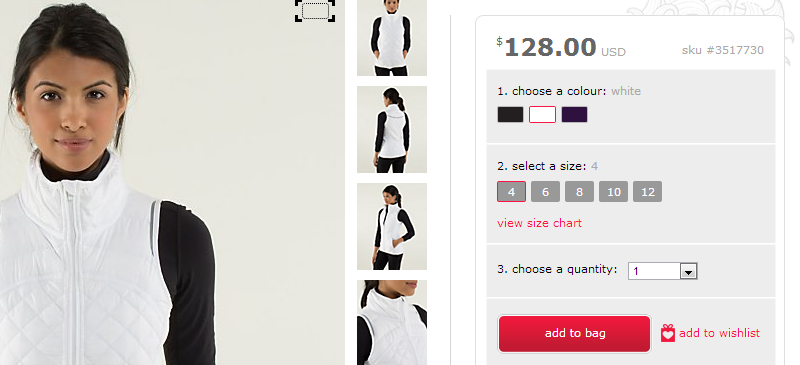
The visitor must first select the color, next select their size and then they can add the product to their cart. Now the CTA really stands out against the grey background.
The CTA should be fairly high on the page, preferably in the top third. This area is sometimes referred to as “above the fold”. In reality, the fold doesn’t exist on websites. However, it doesn’t make sense to force your visitors to work harder to buy your products by pushing the CTA down the page.
One thing to note, if a product is out of stock then display an out of stock message on the page and disable the CTA. Don’t allow a person to click on the button only to get an error message later. If possible, allow the visitor to add their email address so it is possible to notify them once the item is back in stock.
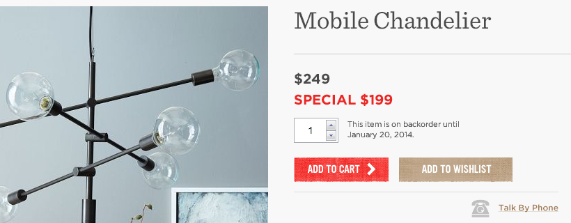
West Elm’s product page shows when an out of stock item will be back in stock.
Increase Trust Factors
Reduce anxiety and build confidence by communicating your return policies and any product guarantees. Product reviews and testimonials show visitors that other people have already purchased and are happy with their decision.
Product reviews have been shown to increase conversions. This is due to the fact that visitors trust other people and their opinions much more than your site. It provides reassurance to visitors who are on the fence about buying.
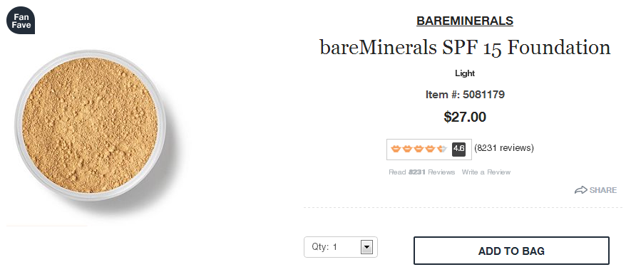
Ulta showcase their reviews right below the product title. In addition they use the ‘Fan Fave’ badge to help show social proof for the product.
Showing that your site is trustworthy also helps to mitigate fears. Often times all the visitor needs is some reassurance before they commit to adding the item to their cart. A small message or safety logo can increase their confidence moving them one step closer to buying.
When a visitor is considering purchasing online they want to trust that if there is a problem they will be able to get it resolved. Clearly post your return policy. Be specific with the conditions; for example do they have 30 days, can they return in stores, etc. If you don’t have a return policy say so (and strongly consider implementing one).

Trust factors on Sur La Table’s product page are located near the Add to Cart button helping to reduce fears and indecision.
More than 80% of consumers feel safer seeing logos of trustworthy payment options on a site.
The Psychology of Online Checkout, GetElastic
Shipping Options
This is critical information that influences buying decisions. The cost of shipping has been identified as one of the main reasons visitors fail to purchase. There is also the question of whether or not the items will get delivered within the time window they expect.
Highlight Free Shipping options on the product detail page. Don’t assume a single message about this is enough for people to remember.
Set Shipping Expectations
Communicating when an item is estimated to be delivered will do a lot to help answer the visitor’s questions before getting into the checkout flow.
41% of online shoppers will abandon a checkout due to “sticker shock”
The Psychology of Online Checkout, GetElastic
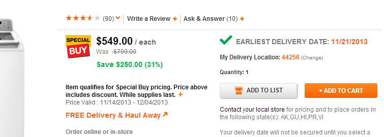
Home Depot correctly sets visitor’s expectations by allowing them to enter their ZIP code to see the delivery date.
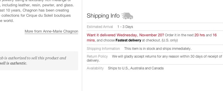
Fab sets expectations and reduces fear and anxiety by answering key questions a visitor likely has. Within this section it also highlights the return policy and where the product can be shipped.
Free shipping
Free shipping is almost expected when shopping online (Thanks Amazon) but if shipping charges are a must then it is important to be upfront with it and not try to hide the costs during the checkout flow. If the visitor is cost sensitive or doesn’t see the value in paying for shipping there is no need to have them go through the process of checking out only to abandon that flow.
Ship to Store
In some cases allowing a product to be shipped to the store is a good alternative. Visitors like the fact that by going into the store they are able to touch, feel and see the product and then if necessary feel secure in the fact they can return or exchange the item right there.
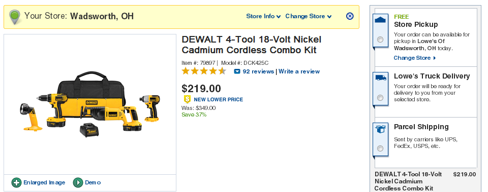
Lowes clearly communicates its shipping options by having the visitor select their option from the product page.
Find in Store
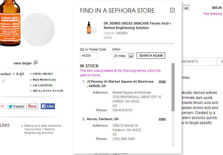
When your visitor has an immediate need your product page should serve them as well. By offering a feature that allows them to find the product in their local store you serve the immediacy of the need without losing the sale due to shipping times.
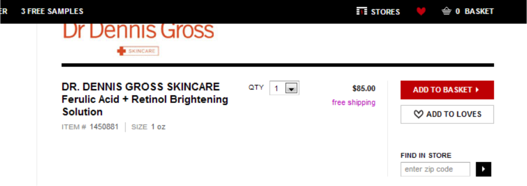
Sephora’s product detail page helps visitors fulfill the immediacy of their need by allowing them to find the product in their local store.
Sizing Information
For retailers that sell items such as clothes, shoes or jewelry providing information about sizes is very important. If a visitor isn’t sure of their size it is a good idea to help them understand sizing before they are asked to select a size. By providing a guide visitors will better be able to choose the correct size the first time, minimizing returns rates.
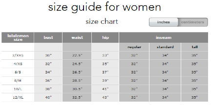
Lululemon has a chart that shows which size is appropriate for the visitor’s body dimensions.
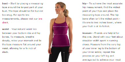
Lululemon also has a diagram that shows how and where the visitor should measure in order to get an accurate size.
Include the sizing information as near as possible to the size options. This helps the visitor locate this type of information.
Selecting a size should not be the barrier to the sale.
Emotional Triggers
Help nudge visitors closer to action by adding in emotional triggers to your product detail page. These triggers are powerful and when used properly will provide a boost to your conversion rates. These triggers can include scarcity, social proof, fear and reciprocity.
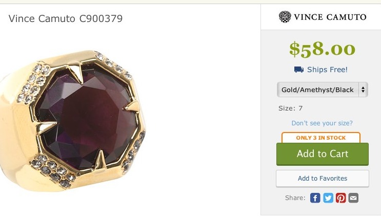
Zappos adds a scarcity to its product page by indicating the limited number of products in stock.
Similar Products
You have the opportunity while the visitor is on your product page to suggest a product that compliments the current product they are looking at or suggest items that may also be considered. Done correctly offering similar products will increase the average order value. However, done incorrectly offering alternative products can be a distraction causing visitors to leave without making any purchase.
In effort to increase average order value you may think about adding these elements higher on the page. Don’t. Offering alternatives needs to be placed lower than the rest of product information.
Showing similar products can be done in various ways.
Bought Together or People Also Bought: Made famous by Amazon, these crowd sourced recommendations show visitors products that were bought at the same time as the product they are currently looking at.
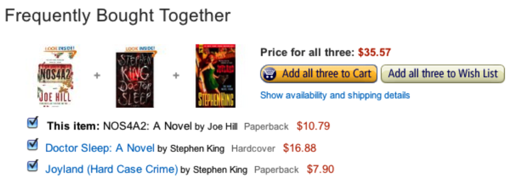
Amazon simply shows the item the visitor is looking at plus one or two additional products that have been purchased together in the past.
Closely Related: Items that aren’t required for the product to work but can enhance its function. Fashion retailers offer additional pieces that can “complete the look” making it easier for someone to purchase a complete outfit.
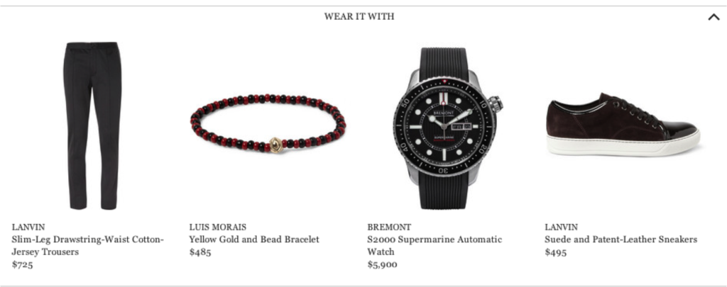
Mr. Porter has a section below that suggests products that can be together.
Additional Items Needed: Products that are needed to ensure the main product functions; for example, additional cables for electronics or batteries for children’s toys.
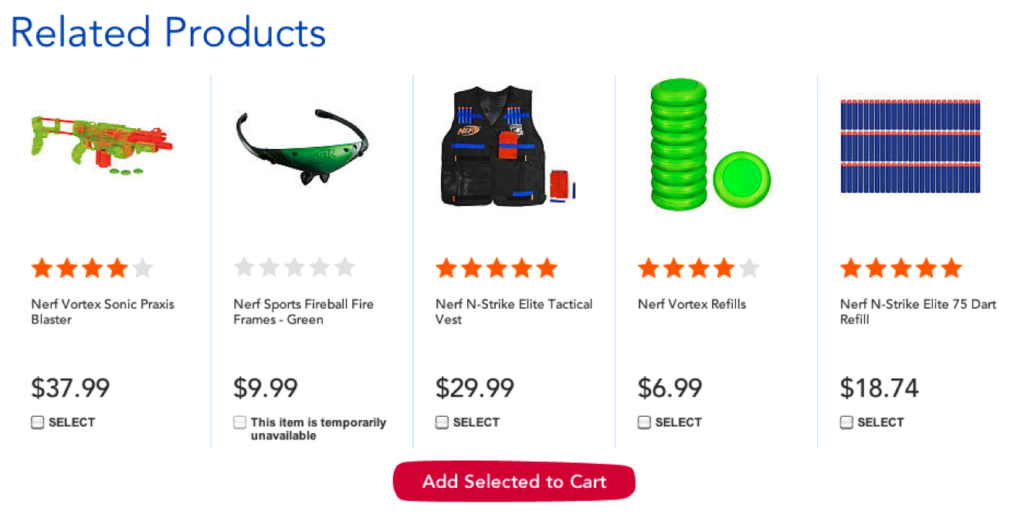
Toys R Us shows additional items that will work well together and make the product work better.
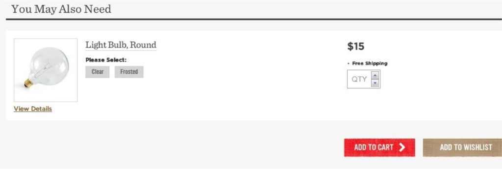
West Elm offers light bulbs to accompany a light purchase. This makes it easier for visitors to purchase everything they need at one time. This technique also helps increase the average cart value.
How Do Your Product Pages Rate?
As the most important page on your site, a product page is responsible for a lot. Answer questions. Convincing your visitor this is the right product. Show off the product’s quality. And, getting the visitor to add the product to their shopping cart.
Make sure your product page is working as hard as it possibly can by incorporating these best practices.
Need a second opinion? Let me know. I’d love to chat with about how to improve your product pages.
