Based off of the research of eConsultancy and my own testing experiences
http://econsultancy.com/us/blog/11125-eight-online-shopping-behaviour-traits-of-men
Efficiency Seekers tend to have a low patience threshold
ES have a much lower tolerance for poorly executed sites. Fundamental usability issues such as not being able to find relevant products quickly, being forced to register at checkout, being asked for too much personal information and poorly designed forms that cause them to receive error messages.
Bad
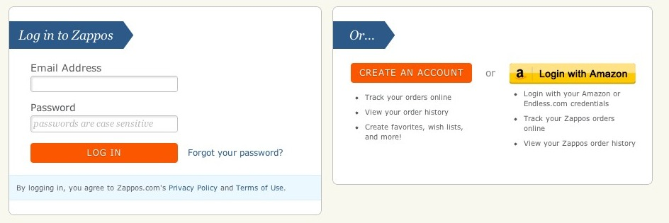
Zappos has a reputation for doing a lot of things well. However, getting into their checkout process could be better. Customers are required to create an account (or log in) prior to entering the checkout flow. Studies have shown this to impact conversion rates.
Better
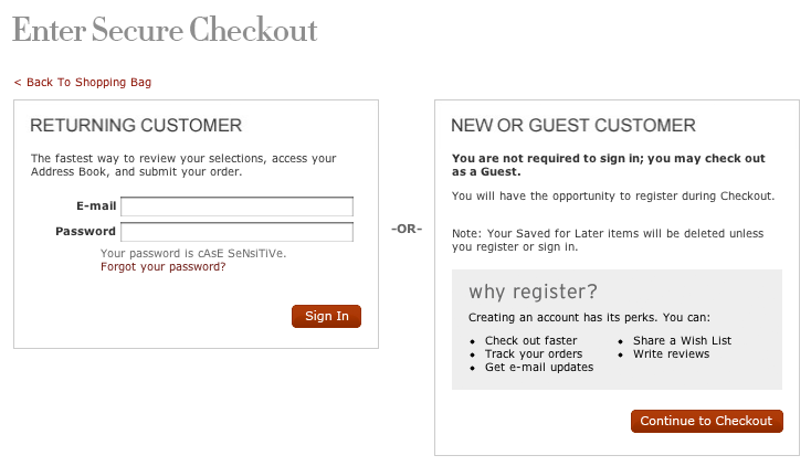
Nordstrom’s simplifies the process and allows a customer to continue as a guest. This allows the person to continue moving forward without interruption. Nordstrom’s could simply this even more by removing the “why register” information from this page since it isn’t relevant at this point in time.
Conventions are an efficiency seekers best friend
Compared to browsers, efficiency seekers are typically more averse to websites that do not stick with standard conventions. Efficiency seekers are looking for an easy experience that matches their expectations from other online shopping experiences. Forgetting (or ignoring) conventions will turn efficiency seekers from engaged and buying to frustrated and abandoning.
Bad
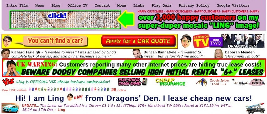
Lings Cars (yes, it’s a real site) follows ZERO conventions. It’s loud, in your face and a little bit schizophrenic. While some suggest that the site actually works well it is a highly risky proposition that I would avoid at all costs.
Better
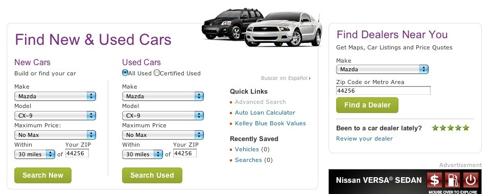
Cars.com follows convention true to form. They focus on visitors’ goals and remove anything that gets in the way. From a recent personal experience the site allowed me to accomplish my research and enabled me to do so efficiently.
A lack of transparency = a lack of trust
One of the easiest ways to build trust and confidences with customers is to be transparent. This builds momentum and allows for clear and friction free shopping experience. This is true for both efficiency seekers as well as browsers. Show transparency by providing information on shipping costs, shipping time and return policy information.
Bad

Macy’s was offering free shipping and an additional 15% off sale however reading through the fine print and excluded items I think it would’ve made more sense if they just said what ten items were on sale.
Better

Zappos shines again in its truthfulness and transparency. They clearly state they don’t offer coupons and explain concisely why they don’t. One well known fact is that Zappos also offers free shipping both ways and here too there are no disclaimers or caveats.
Efficiency Seekers will pay for convenience
Convenience is highly valued by efficiency seekers. This means that shipping and returns policies aren’t as much as a friction point and has less influence of this group of shoppers. Efficiency seekers tend to be more realistic about the cost of expedited shipping and are more willingly to pay higher shipping costs (especially if they have waited until the last minute to buy something. Yes, personal experience).
Bad

Barnes & Noble misses out on the fact that some people want their products sooner than others. While offering free shipping has come to be expected and is nice, they fail to allow for customers to change their shipping options.
Better

Amazon provides the option to get my item the very next day if I desire to do that. (Note that the shipping prices displayed are lower since I’m a Amazon Prime subscriber.)
Filtering helps winnow down product choices
For retailers with a large product offering providing a way to filter out choices is an essential tool for efficiency seekers (as well as most shoppers). Efficiency seekers, as the name suggests, are looking for the most efficient way to complete their task. Filters allow for a large catalog of products be winnowed down to a grouping that is highly relevant to them.
However, it is important to understand that filtering is not navigation. Navigation is about finding, whereas filtering is about refining. When providing filters expose those that are the most important and provide the most value to the broadest group of shoppers (gender and price are two examples). It is also a good idea to allow multi-select attributes within a given facet (i.e. color, brand, etc.).
Bad

Restoration Hardware offers zero refinements. Basically you can navigate to a listing of products but you cannot refine the listing to a smaller group based on what you specify.
Better

Crate & Barrel allows customers to refine the product listings to match specific criteria (under $1200 and brown).
Quick decisions are possible when expectations are met
Efficiency seekers are more likely to make quicker purchase decisions than those who are just browsing. Efficiency seekers are more task-orientated and want to get through the shopping process with less interaction and consideration. When looking at product details efficiency seekers tend to be drawn to looking for information about the product that answers specific questions.
Bad

Imagine your are trying to buy pet food. Petco relies on its navigation to move a person into the section specific to your pet, then find the food section and finally select a brand. While this isn’t horrible, and they do provide shortcuts, it can be improved.
Better

In the same scenario on Wag.com a customer can chose their pet and brand right from the same page. Making the purchase decision incredibly easy and efficient.
Work to eliminate unnecessary personal information
An all around best practice in form design is to avoid asking for un-necessary information during the sign-up or checkout process. A site must allow shoppers to move through the checkout without slowing momentum by asking for information that isn’t relevant or necessary to complete the purchase. A good example of this that retailers often fall victim to is forcing shoppers to register prior to checking out. This isn’t relevant to the purchase and in turn feels unnecessary to the shopper. Other examples of this are date of birth, gender and forcing email opt-ins.
Bad
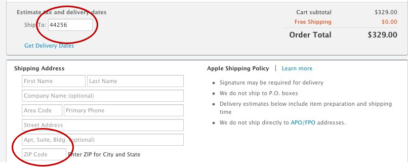
Apple does a lot of things well however, when checking out they ask for your ZIP code in order to give you the delivery date. But after continuing they fail to carry the ZIP through to the next page where you enter your shipping address. While small details like shouldn’t be missed.
Better
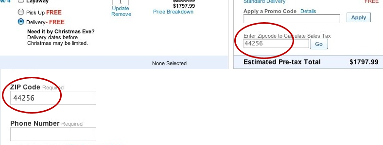
Sears asks customers to enter their ZIP code to calculate the sales tax on the first step of the checkout and then on the second step where the customer is entering their shipping information the ZIP code is carried through and pre-filled.

