Often the home page is the page most frequently debated. eCommerce companies like to spend time thinking and over thinking what marketing messages go on the home page, where it goes, how frequently the message changes out. Unfortunately this is often wasted effort.
There are plenty of pages on an eCommerce site that would benefit from the amount of time spent on the home page bad sadly, it doesn’t happen like it should.
So if eCommerce sites are going to focus on the home page at least focus on the right things.
5 Things Your Home Page Must Do
- Speak the same language as your visitors
- Say who the website is for
- Communicate the core benefits of your business
- Build trust
- Move a visitor towards action
1. Speak the same language as your visitors
Make sure your language is clear enough for visitors to understand how you can help them. Avoid jargon or overly complex language.
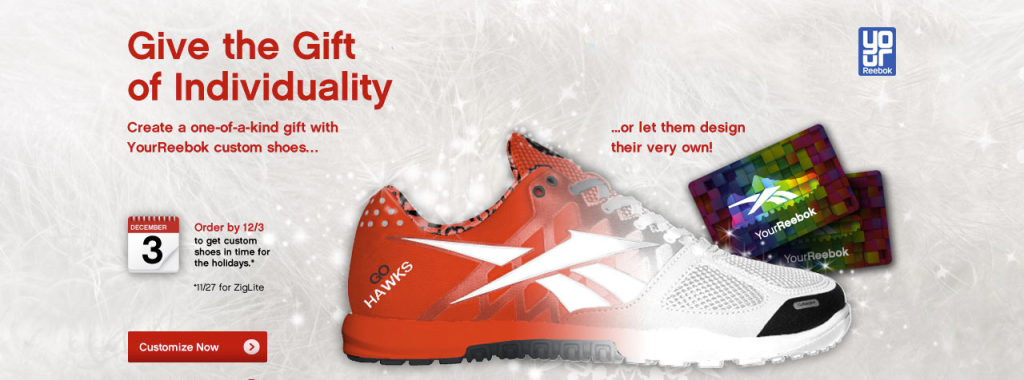
Reebok combines a strikingly visual image along with a compelling headline to describe what they want the visitor to do. The headline, “Give the Gift of Individuality” and the sub-hed of “Create a one-of-kind gift with YourReebok custom shoes…”, speak to the visitor without jargon and clearly tells them what they need to know.

Because of what time of year it is a lot of people are looking for gifts, Godiva clearly tells the visitor that they can provide the perfect holiday gift. The images, headline and call to action (while rather small) all communicate the same focused message.
2. Say who the website is for
One of the first things people do when they get on a page is try to figure out if they’re in the right place. Know your audience, and do an excellent job of reassuring them that they belong on your site and have found the right business or service for them.
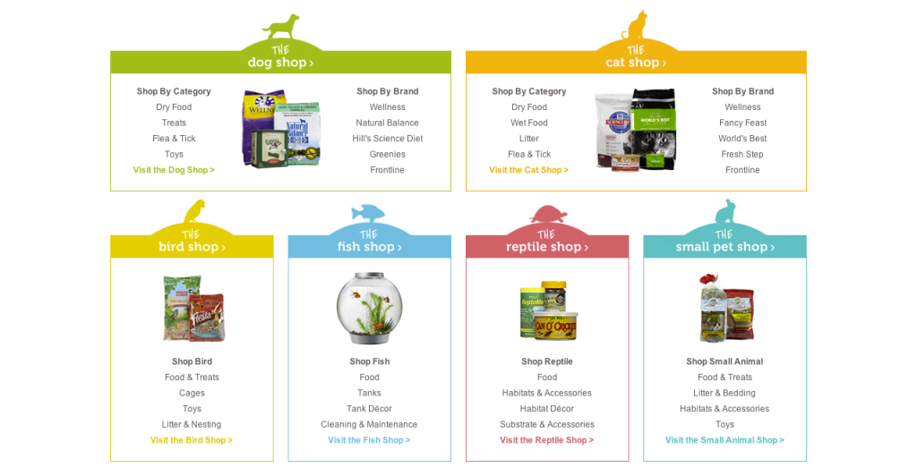
Wag.com does an outstanding job with the way the communicate who the site is for. They segment the content into sections like dog, cat and reptile. Each section then shows a number of trigger words (words that visitors are search for). These triggers clearly indicate who the site is for.
3. Communicate the core benefits of your business
It is important not to confuse features with benefits.
A feature is a name or label, while a benefit is the result that of product features.
Your home page should be focused on the big picture of benefits you can provide.
It should make it clear why visitors should stay on your site and consider choosing you.
Example – Adaptive headlights:
Feature: Xenon Adaptive Headlights with dynamic auto-leveling
Benefit: Adaptive Headlights cast their beam in the direction of the curve and ensure better visibility and more safety during night drives on winding roads

Lululemon does two nice things with their homepage. One, it shows the benefit of using their products, statying warm while running in the cold winter months. And two, letting the visitors know that the product is available for both women and men.
4. Build Trust
Visitors want to know that they can trust you.
Build trust by using testimonials, recognizable logos, and trustmarks (such as SSL, Verisign, and HackerSafe). An easy thing you can do to improve your level of trust is to get a testimonial from a happy customer, preferably with a photo, and use it on your home page.

Near the footer of the pages, Folica does a couple of nice things. One, they show trustmarks indicating their site has been tested and is secure. Folica also reinforces the trust factor by showing the “Trusted by Google” badge. Two, and maybe more importantly, above the trustmarks they talk about their product reviews and 70,000 customer ratings. This shows that other “real people” are using the site and will be able to provide recommendations

Showing a variety of brands on the eBags website helps to show visitors that they can trust they will find the product they are looking for while browsing the site.
5. Move a Visitor Towards Action
The homepage is responsible for providing visitors with a clear path to what they are looking for. Look at it as a filter, not a destination. It’s important to move the visitor thoughtfully forward from the homepage into a conversion funnel and not just to another random page on your site. The homepage should move visitors forward towards completing their goal – and into a conversion funnel in which they move from interest to contact with you.
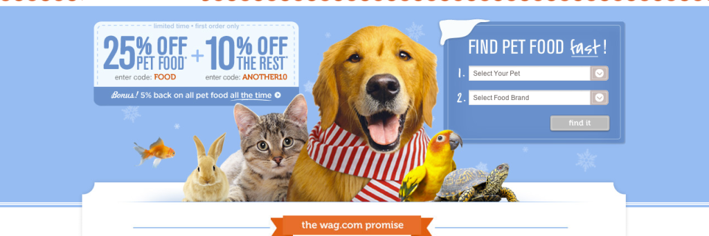
One of the first thing showing on the Wag.com website is the “Find Pet Food Fast” call to action. This is an excellant example of moving a visitor towards action that also aligns with a business goal. Wag.com understands that a portion of its audience are efficiency seekers (visitors who come to a site looking to complete a specific task and move on) and is able to provide an efficient way for them to move forward.

