Your website should immediately answer 3 questions for site visitors: Where am I? What can I do here? Will this site solve my need (why should I stay)?
Where am I?
Visitors are often coming to your site from a search on Google so the page they land on must communicate where they are. This means two things. One, they need to understand what site the link took them to. And two, where on the site they are. Answering these questions for visitors will enable them to orient themselves quickly and move on with completing their task.
Don’t depend on your visitors to figure you out if they are on the right site. Instead, recognize that your visitors arrive with a set of specific expectations, it is your job to reflect those expectations on your landing page.

Doing a search on Google for ‘computer backup’ displayed a sponsored Carbonite ad. Clicking on the link takes me to a landing page specifically designed to indicate where I am.
What can I do here?
After visitors understand where they are they then need to evaluate their options of what they able to do. If they are shopping for something will the site allow them to purchase the product or is it an informational site only? Can they compare products or does the site offer only one option? Your landing page should very quickly answer this question. This is an important part of the process. It demystifies your offering by helping the prospect establish some expectations. It increases the customers’ comfort level.

SugarSync makes it clear that signing up for their service is the the only thing they want you to do. Plus this is what a visitor is more than likely looking to do so it matches their expectations as well.
Will this site solve my need?
After getting past the first two questions the visitor needs to decide whether or not the site will solve the visitors problem. If the visitor is looking to buy a specific brand of shoes does the page give the visitor confidence that they will be successful? If not, they are more likely to leave starting the process over again.
Remember that people go to your site because they are trying to solve a problem and you might have a solution for them. Within seconds you can lose a visitor. Don’t force them to find the information they need instead your website should do the heavy lifting and provide it to them.

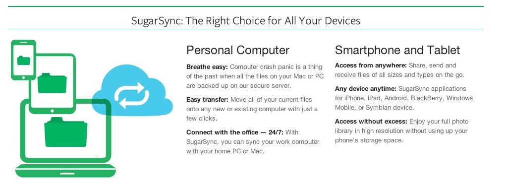
Knowing that visitors are looking for answers that make it easier to get to a buying decision SugarSync clearly outlines why their service is the right backup service to use. This helps to answer questions while showcasing its features.
It’s important to note that any page your visitor lands on is then a “landing page” and must convince the person to stay on your site. Find the top landing pages within your site and start optimizing those first.

