Do you wish you could receive a much higher eCommerce conversion rate from your website?
Most eCommerce websites have a conversion rate of only 3%. This means for every 1000 visitors who arrive on your eCommerce website, only 30 end up purchasing.
Below is a list of simple improvements that will help you increase your eCommerce conversion rate and turn more visitors into customers.
If your goal isn’t to create a better customer experience, what are you doing that is more important?
16 Quick Ideas to Increase Your eCommerce Conversion Rate
1. Prominently display any reasons to buy or value propositions.
Free shipping, free returns or price guarantees are examples of value propositions that should be shown off. Include these messages in prominent locations to increase their visibility. Site wide headers and near calls to action are a couple common placements.
Keep these value propositions top of mind when want to minimize visitor doubt and convince them to purchase from you.
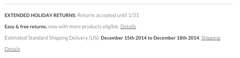 Jack Threads talks about their “easy” and “free” returns on the product page helping to reduce visitor doubt.
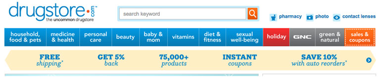 Drugstore.com has a banner speaking to five buying propositions helping to solidify why someone would buy from them.
 Drugstore.com’s sister site Beauty.com does something very similar with their buy propositions.
2. Make sure you have a highly visible add to cart button
Imagine the frustration a customer would feel the moment they have decided to add your product to their cart but they aren’t able to find the add to cart button. They’re gone—never to return.
The add to cart (and any CTA) must stand out from the rest of the page content. Try using a contrasting color from the color scheme of your site but still fitting in with the overall design. The size, color and placement of the add to cart button all effect sales.
Quick Test. Zoom out your browser window to something like 25%. Make sure you can easily find your add to cart button.
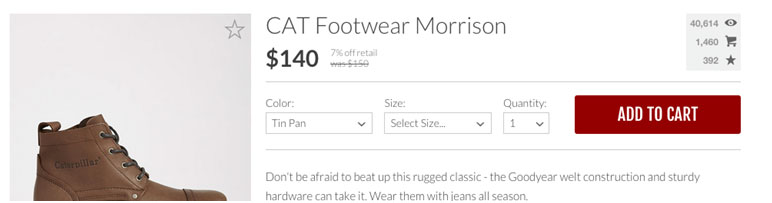 Jack Threads CTA is incredibly visible—bright red against a white background.
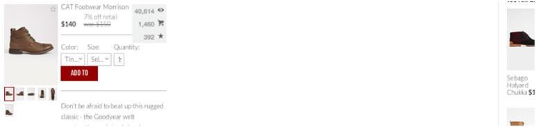 Even when scaled down to 25% within the browser the CTA still clearly stands out.
3. Reinforce your eCommerce site’s security
Work to eliminate any fear a visitor may have when checking out by adding two simple words: Secure Checkout.
However, be careful to not overdo the trust factors. A OneUpWeb study found that 77% of visitors expect a eCommerce website to be trustworthy. So it is possible that displaying too many trust symbols you may spook your visitors.
Often eCommerce sites will place trust symbols throughout the entire checkout process. Instead, try moving these trust symbols closer to critical elements such as the credit card fields.
 Modcloth has a simple and very subtle way to reinforce their security.
 Dot & Bo has a more “in-your-face” approach and displays logos of trust symbols. Test this approach as it has been shown in the past to actually hurt conversions.
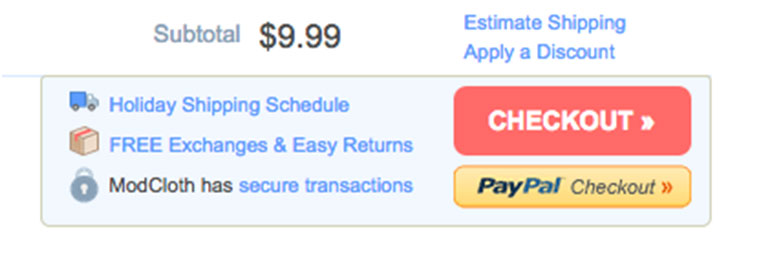
4. Display shipping promotions near CTAs
High shipping cost is one of the main reasons visitors abandon their purchase. Take advantage of free shipping by calling out the promotion near your CTA. By clearly displaying free shipping near the CTA you will help to reduce any visitor doubt about buying from you.
In addition make sure your free shipping promotions are carried throughout the entire checkout process. Continually nudge visitors forward in their journey by reducing anxiety and doubts.
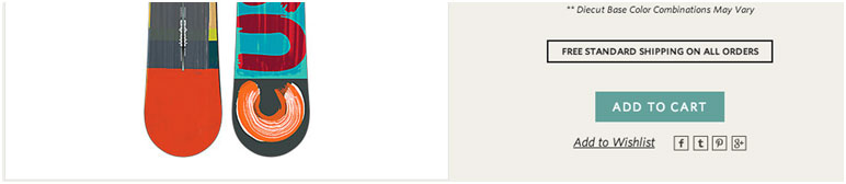 Burton places their Free Shipping message directly above the CTA. This a good example of showing the buy proposition near the main Call to Action.
 Zappos, the ultimate example, incudes their free shipping message right above the CTA.
5. Communicate scarcity
Help nudge visitors closer to action by adding in emotional trigger such as scarcity.
An easy way to add a scarcity is by indicating the limited number of products in stock. This creates an emotional response like, “I don’t want to miss out,” persuading the visitor to take more immediate action.
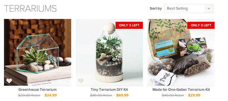 Dot and Bo (http://www.dotandbo.com/) call out the quantity left on both their gallery and product pages.
 Product Page
6. Allow for different payment options
Many customers will choose to pay with their credit card. However, there are a segment of customers who would prefer to use an alternative such as PayPal
A simple way to increase your eCommerce conversions is to make sure you satisfy both types of customers.
PayPal’s top customers make an average of 98 online purchases per year, with a total value of $4,214
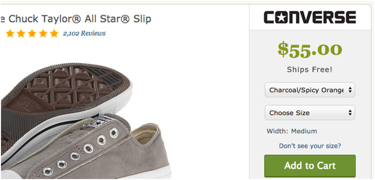
ModCloth does a nice job of giving visitors an alternative payment method without cluttering up the checkout.
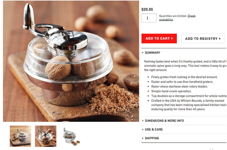
7. Increase the number of product photos
Because the visitor cannot physically touch and feel the item they must be able to get a sense of the product by using images only.
When possible, showing images in context will go a long way to reduce the fears and doubts.
 Williams-Sonoma tells a complete story by showing the outcome of the product.
 However, if Williams-Sonoma were to show only the product image, the story feels incomplete and forces the visitor to think about the benefit.
8. First-time purchase experience
Increase the likelihood of converting a visitor into a customer by giving them an incentive to purchase from you. Make a good first impression on a new visitor by giving them a coupon to use on their first purchase. As an added benefit you get their email address that allows you to reach back out in the future.
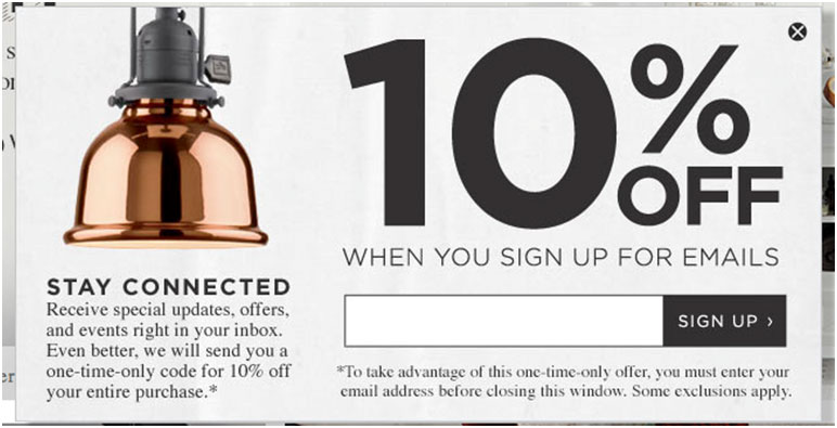 This is a typical first-time offer—trading an email for a percentage off.
9. Don’t make visitors do extra work
Don’t make visitors enter the same information more than once. A primary example is allowing a customer to enter their billing information and then using that information for the shipping information.
Where possible pre-fill fields with information you already know. One way to do this is instead of asking for City and State, ask for ZIP code first then prefill city and state after the visitor enters their ZIP code.
One other item, ask only for the necessary information. Asking for too much is a hassle and could be seen as an invasion of their privacy.
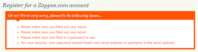
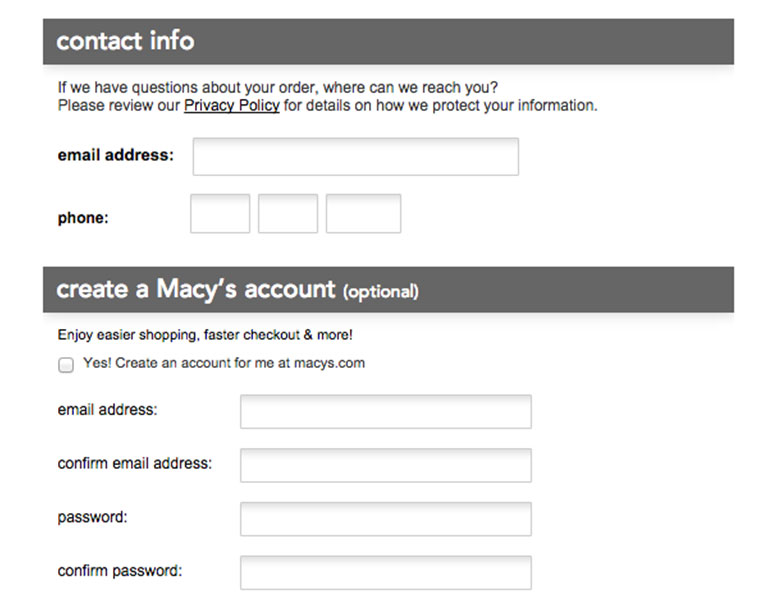 When looking to create an account Macy’s asks me for my email information again — two form fields after they asked for my email address. Then they want me to confirm my email address.
10. Keep form labels visible
In an effort to reduce space and visual clutter sometimes eCommerce websites will remove a field label and place it inside of the form field itself. This is a bad idea.
With the label removed, the intention of the field is hidden. This forces the visitor to rely on short-term memory to remember what they need to enter. Visitors will often get distracted, look away and then when returning to the form forgets what the field was for.
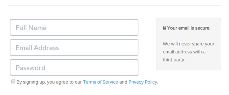 Stackskills sign up form has labels placed inside of their form fields. While this saves a little space it is also easy to forget what you are filling out.
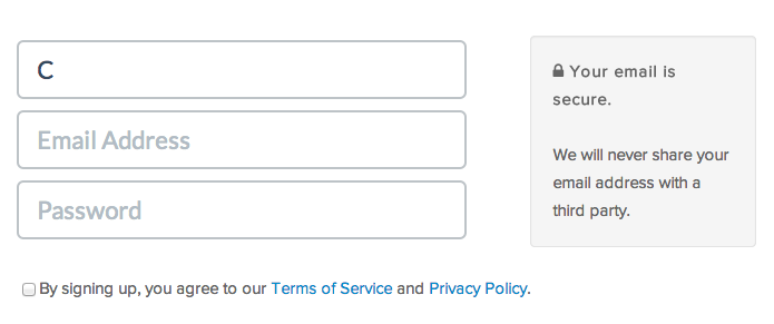 As shown by the form above—was it first name, full name, username?
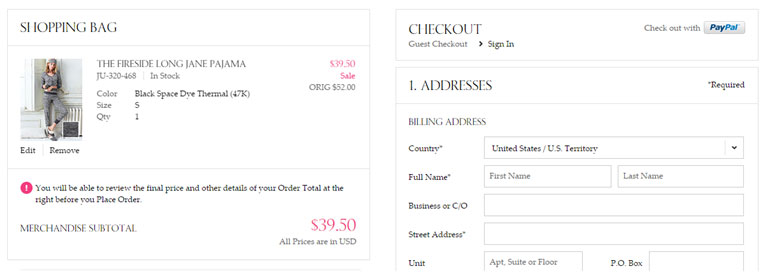
11. Provide a guest checkout option
Don’t ever force a visitor to register on your site in order to checkout. This is a huge eCommerce conversion killer. Ensure that people can continually move forward through a guest checkout flow.
The doorway into the guest checkout should be the same or more prominent than the registration flow. eCommerce retailer ASOS cut its shopping cart abandonment by 50% by removing any mention of creating an account.
There is nothing wrong, at the end of the guest checkout, to ask visitors for a password. This will allow them to create an account but as an option at the end of the checkout process.
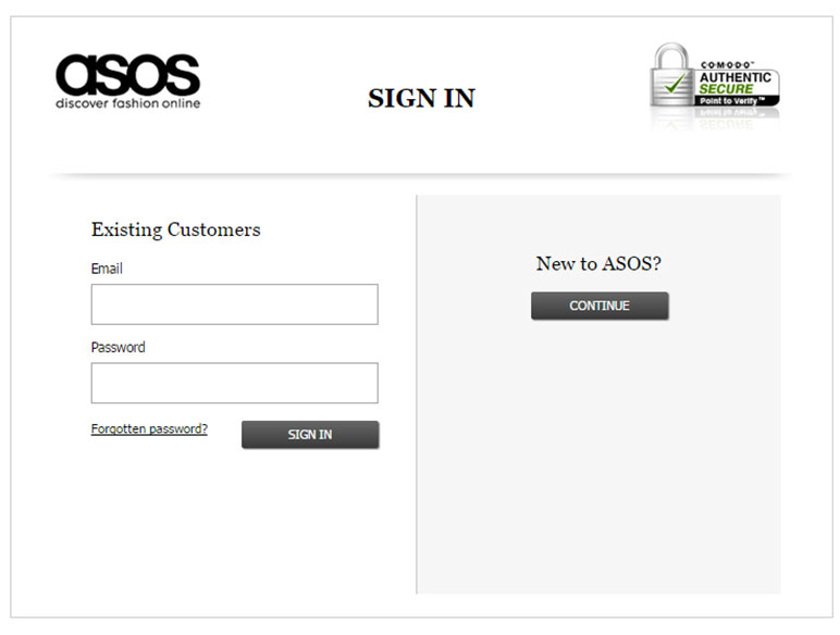 Simple checkout options used by ASOS.
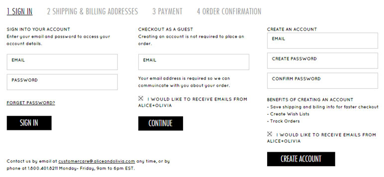 Now compare ASOS with Alice and Olivia’s. Their checkout is rather a mess. Six form fields and three CTAs make it more difficult for a visitor to make quick decision.
12. Avoid unnecessary buttons within the shopping cart
Remove additional and unnecessary buttons and show only the primary CTA within the checkout page. By having buttons everywhere you force your visitor to stop and think which action they need to take.
Your goal is to make the checkout experience as quick and simple as possible. Make it clear what is the primary CTA so your visitor has no doubt what they should do next.
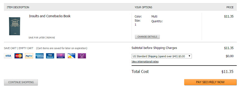 ASOS has a fairly simple cart with limited buttons. The CTA clearly stands out in yellow. Notice how the CTA label reinforces the site’s security.
 Compare the ASOS cart with that of Kay Jewelers. The second cart has a lot of different CTAs all of equal weight and no clear next step for the visitor.
13. Close your cart
When the visitor is in the checkout flow they aren’t shopping – their goal is to finish their purchase. And because of that elements like the navigation are no longer needed.
Limit the navigation and exit points within the cart to reduce abandonment and help keep the visitor’s focused. If you have links within your cart for things like FAQs or guarantees make sure they open in modal (lightbox) windows.
Keep only the logo linked to your home page but work to keep visitors moving towards the order confirmation page.
One of the best ways to increase your page conversion rates is to simply remove the main navigation from the page. Hubspot
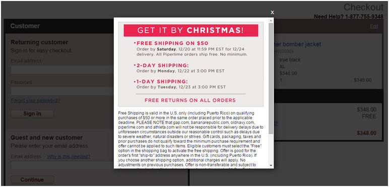
 Dot & Bo removes the primary navigation which is good. However, links like email us and money-back guarantee take the visitor away from the shopping cart.
 Conversely Gap.com’s checkout removes the navigation but links to the free shipping details opens in a lightbox, keeping people within the cart.
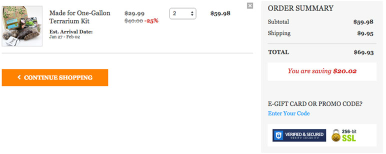
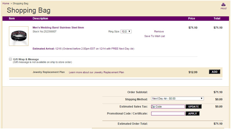
14. Show total pricing upfront
One of the top reasons for visitors to abandon their shopping cart is high shipping prices. Be transparent and tell visitors how much shipping is going to be for the items in their cart. This will help them understand the final amount before starting checkout process.
Don’t surprise visitors by adding additional costs while they are in your cart.
 At step two within Victoria Secret’s checkout flow still no mention of the shipping costs. Shipping costs don’t show until you are a few steps into the checkout flow.
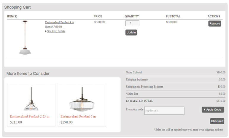 Rejuvenation shows the shipping costs and any shipping surcharges so not to surprise visitors later in the process.
15. Check your error messages
Are your error messages and alerts clear and understandable? Visitors are going to have errors. There is no getting around this fact. But when they do, are they able to recover and continue moving forward?
Check your error messages and make sure they tell visitors what they must do to correct the problem. In addition make sure your messages sound like a real person talking and not a bunch of system text.
Pro Tip: Use a text to speech tool to read error messages and alerts out loud. Hearing what the messages sound like for real makes it easier to sound human.
 Zappos error messages tell visitors how to correct the problem and when read aloud sound human.
16. Add a “shop with confidence” call out
Visitors often have a bit of hesitation even when ready to go through the checkout flow. It’s your job to build trust and confidence and keep them moving forward.
A “shop with confidence” call out should quickly communicates why people should buy from you.
Examples of what a confidence call out may include:
- Money- back guarantee
- How long you’ve been in business
- A secure online payment process
- A no-hassle return policy
- How fast their item(s) will ship
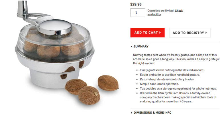
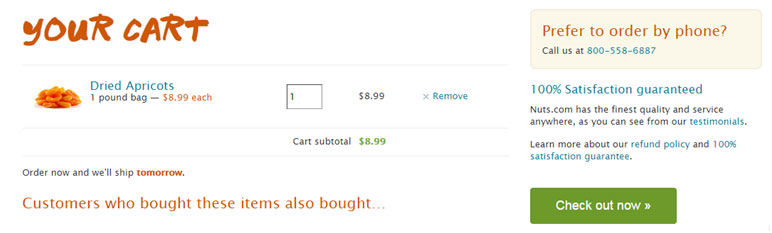 Nuts.com has prominently shown the guarantee right above the checkout CTA in the cart.
Conclusion
Now when you wish you could receive higher conversion rates you have a quick list to get started with. Increasing eCommerce conversion rates can be improved by implementing a few simple changes.