Payment-option clarity often lurks in the background of checkout flows—but it turns out that early visibility can unlock real revenue gains. In this Ways to Pay card case study, we tested adding a compact, clear-call module on the product-listing page (PLP) and delivered a striking +8.3% revenue per visitor (RPV) lift. Here’s how the experiment unfolded, what worked, and what your brand can learn.
The moment
Visitors were browsing, not yet sold. Payment options felt hidden until late.
The bet
Add a compact Ways to pay block on the PLP with a clear CTA to learn more. Build confidence early without sending people sideways.
The setup
- Audience: all non-credit-card visitors
- Split: 50 to 50
- Devices: mobile and desktop
- Placement: inline panel on engagement PLPs with expandable detail
- Primary KPIs: Conversion, AOV, RPV
As Baymard Institute research shows, 11% of users abandoned a checkout in the past three months simply because their desired payment option wasn’t available.
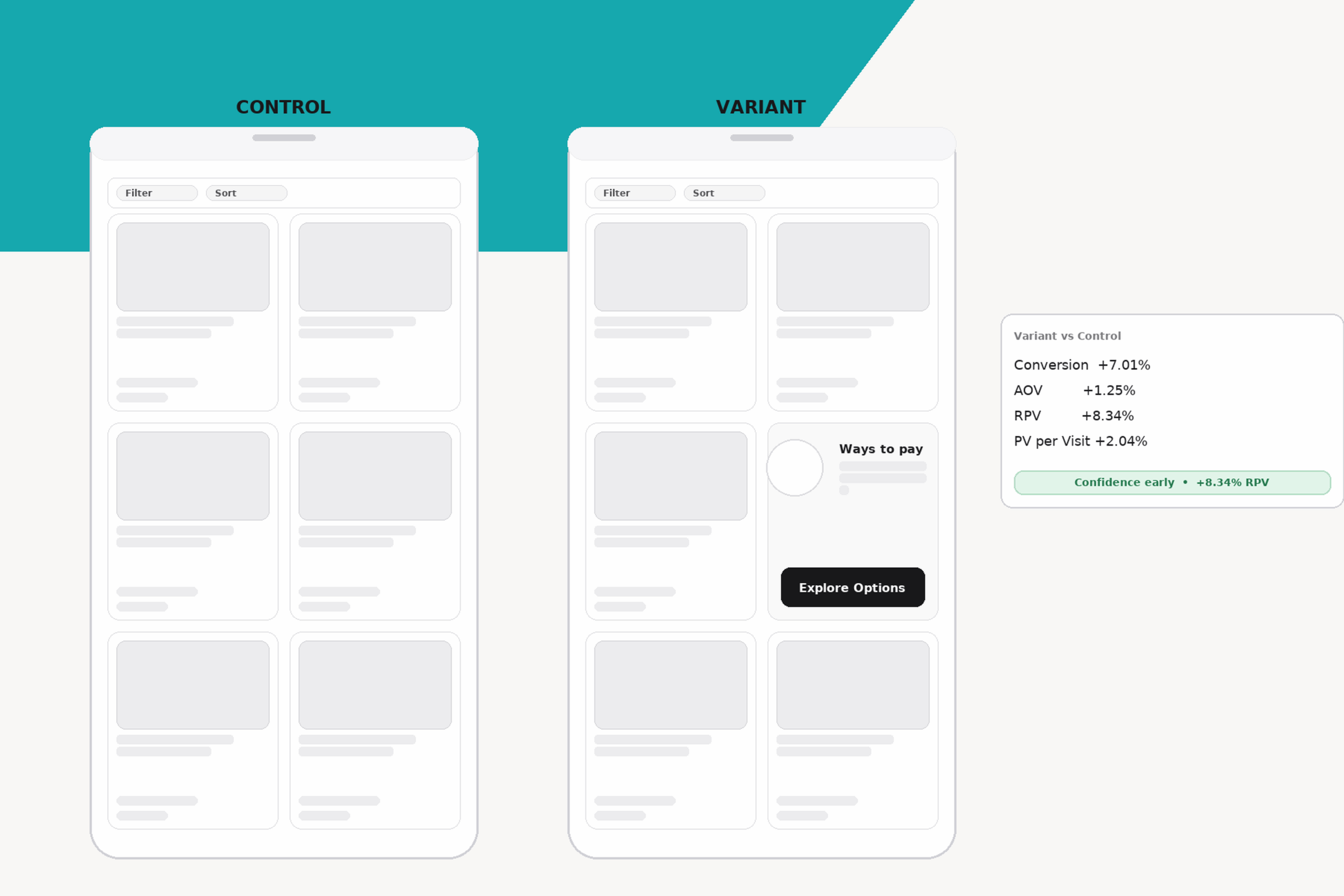
What happened
- Conversion: 0.67% to 0.72% (+7.01%)
- AOV: $823 to $833 (+1.25%)
- RPV: $5.52 to $5.99 (+8.34%)
- Product Views per Visit +2.04%
Why it worked
Payment clarity reduces perceived risk. Showing it on the PLP closes the affordability loop before the PDP.
Design choices that mattered
- Keep it short with one primary CTA
- Do not compete with filters and sort
- Use plain, friendly language
Guardrails
- Monitor off-PLP clicks so you do not leak traffic into dead ends
- Keep the footprint compact on mobile
What I would test next
- Tune copy by price band
- Show split pay vs financing examples by category
Takeaway
Small clarity early raised both conversion and revenue density.
Explore more case studies:
- Ways to Pay Card Case Study: +8.3% RPV Lift
- PLA Landing Page Case Study: Turning “Near Miss” Visits into High-Value Orders
- Promo Drawer Case Study: 60% Fewer Promo Clicks Yet Revenue Improved
- Post-Add-to-Cart Lightbox Case Study: Interrupting Flow and Lowering RPV
Full Case Study Library