If you’re serious about improving conversion rates, stop chasing best practices and start removing friction.
Friction isn’t just a bad layout or a slow site. It’s anything that makes a visitor stop, think too hard, or second-guess their next step. And it shows up in subtle ways: cluttered product pages, overwhelming filter panels, unclear promotions, or even too many decent choices.
This post breaks down how to identify the real ecommerce friction reduction opportunities that are quietly hurting your performance. And how to fix them in ways that actually move the needle.
1. Friction = Mental Load
Most visitors don’t bounce because your site is ugly. They bounce because it’s exhausting to shop.
That exhaustion often comes from:
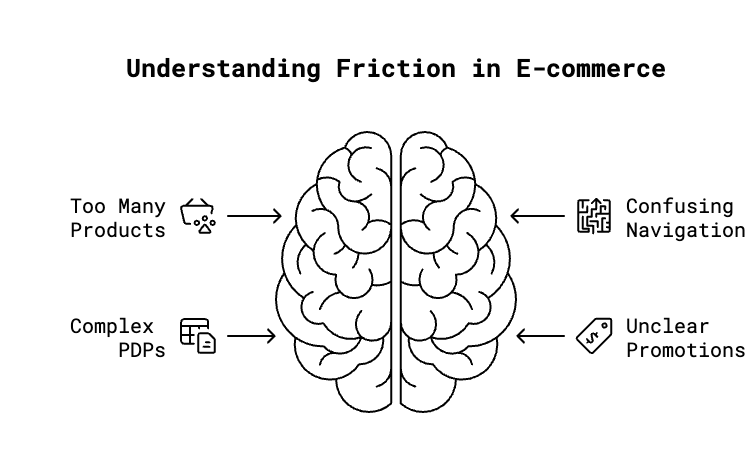
- Too many products with no clear starting point
- Navigating categories through confusing promotions
- PDPs that require a spreadsheet to make sense of options
This isn’t opinion. It’s behaviorally backed:
- Hick’s Law: More choices = more decision time
- Paradox of Choice: Too many options = buyer paralysis
- Cognitive Load Theory: The brain can only handle so much at once
If your site forces visitors to sift, decode, or overthink, you’re introducing friction. That friction kills conversions
2. Where Friction Shows Up (and How to Spot It)
Here’s what I look at when analyzing a site:
Adobe Analytics (or any analytics tool):
- Funnel drop-offs
- Bounce and exit rates by page
- Filter usage (and non-usage)
- Promo clicks vs actual conversion
Heatmaps and session replays (HotJar, Clarity):
- Where people stop scrolling
- Where they rage click
- Where they backtrack or loop behavior
Pathway analysis:
- What’s the route from homepage to purchase? (Who enters through the homepage, right?)
- Are visitors forced to make unnecessary choices or jump through hoops?
Friction red flags to look for:
- High-traffic pages with low interaction
- Visitors using search immediately after landing on a category
- Repeated promo clicks with little to no downstream engagement
- Filters with high visibility but near-zero usage
None of this is about vanity metrics. It’s about identifying what’s slowing people down.
3. High-Impact Ways to Reduce Friction
Let’s skip the generic advice. These are specific ecommerce friction reduction tactics that work without a complete overhaul.
Reduce Choice Paralysis
Thousands of products with no entry point is a dead-end.
Visitors aren’t here to browse—they’re here to find.
- Use curated categories like “Bestsellers,” “Top Gifts Under $100,” or “Back in Stock”
- Show fewer filters by default—expand only when needed
- Use what you know (intent, affinities, behavior) to personalize options
Stop Using Promotions as Navigation
If your main CTA is “Shop the Sale,” you’re not guiding—you’re distracting.
- Put promos where they help convert (like PDP or cart), not where they compete with navigation
- Simplify the messaging—one message, not three overlapping ones
- Test drawers or toggles to deprioritize promo banners without removing them entirely
Simplify PDPs
Most product pages don’t need more content. They need less confusion.
- Prioritize info that helps decision-making
- Use progressive disclosure to hide less critical details
- Minimize cognitive fatigue—especially for mobile visitors
- Most PDPs force too many micro-decisions at once (size, color, metal, shipping). Instead of helping visitors decide, you’re making them triage.
4. Quick Wins vs Systemic Fixes
Not all fixes require a redesign.
Start with low-effort, high-impact changes:
- Remove cluttered banners
- Simplify filter panels
- Cut promo noise on high-intent pages
Then layer in the bigger work:
- Rethink category structure
- Build guided shopping flows
- Personalize entry points based on intent
Quick wins earn trust. But without connecting them to broader fixes, your team risks celebrating a 1% lift while ignoring a 20% drop-off three clicks away. The real value comes from building momentum toward systemic change—fixes that actually scale.
“We’ll test this and see what happens” is fine. But “We’ll test this as a step toward making X easier for the customer” is better.
5. Real-World Results
- Promo clutter removal: On one retailer’s site, we eliminated an above-nav promo banner that repeated across every page. The result? +18% lift in clicks to core categories, +9% increase in add-to-cart rate over two weeks.
- PDP simplification: By collapsing less-used details and moving comparison charts behind toggles, we saw a +12% lift in mobile conversion.
- Filter reduction: On a high-volume PLP, removing underused filters and highlighting just three meaningful ones led to a +6% boost in engagement and lower bounce.
Small changes, big impact—when they solve the right problem.
Final Thought
Visitors won’t tell you your site is hard to shop. They’ll just leave.
If you want help with ecommerce friction reduction that actually impacts revenue, let’s talk.