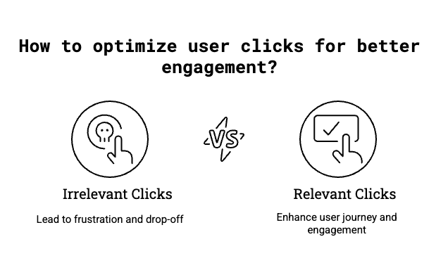
There’s a myth in eCommerce: fewer clicks = better experience. In this case, eCommerce friction points aren’t about steps it’s about irrelevant steps.
But most drop-off doesn’t come from too many clicks. It comes from irrelevant ones—clicks that lead to dead ends, product overload, or decision fatigue. In reality, the right extra click—the one that narrows intent or adds context—often improves the journey.
This article breaks down the biggest mistakes I see in eCommerce funnels, from product discovery to checkout, and offers fixes that prioritize clarity, momentum, and customer control—not shortcuts.

Mistake #1: Sending Visitors to “View All” Pages
The Problem:
Dropping someone into a massive category with 1,000+ products and no guidance is the digital equivalent of “good luck.” Filters are hidden. Scroll fatigue kicks in. Bounce rates spike.
The Fix:
- Start the journey with a single guided question (e.g. “Who are you shopping for?”). One prompt beats a blank grid.
- Use curated entry points like “Top Picks,” “Gifts Under $500,” or “Back in Stock”
- Add contextual prompts at the bottom of the PLP: “Too many results? Try these filters”
Key Insight:
More clicks isn’t the enemy. Irrelevant clicks are. Slowing visitors down with intention increases relevance—and revenue.
Test result:
On one site, we replaced the “View All” PLP with sub-category buttons. We asked visitors to narrow down what they were looking for (yes, it added a click). Result: +5% conversion rate, +4% increase in revenue per visitor.
Mistake #2: Leading With Price
The Problem:
Highlighting “Under $200” or “Shop the Sale” up front conditions visitors to focus on price—not value. It shrinks the assortment before they’ve had a chance to fall in love with anything.
The Fix:
- Lead with desire. Showcase your best hero products first—then let visitors sort by price
- Push promo messaging deeper into the funnel (on PDPs or in cart), not at the top of nav
- Create pricing paths only when intent is clear (e.g. “Gift Under $100” during holidays)
Key Insight:
Promos should help close—not guide—navigation. Over-indexing on price can drag down AOV and commoditize the experience.
Mistake #3: Treating Filters Like a Utility, Not a Feature
The Problem:
Most visitors don’t use filters. Why? Because they’re buried in a hamburger icon or buried under irrelevant options.
The Fix:
- Highlight 3–5 filters that actually matter (e.g., metal type, fit, style—not dozens of redundant options)
- Make filters feel visible and interactive—not just functional
- Test a “guided filter” that requires input before showing products
Key Insight:
One test increased filter usage by 50% simply by visually calling out top filters above the grid. Visitors want help—they just won’t dig for it.
Mistake #4: Stacking “Helpful” PDP Features That Actually Hurt
The Problem:
“Complete the Look” sounds helpful. But in practice, it’s often distracting—and in some cases, damaging. We’ve seen shoppers trade down or abandon when confronted with upsell noise too early.
The Fix:
- Use progressive disclosure: collapse or toggle non-essential details
- Shift cross-sells to post-ATC moments (e.g., cart add-ons, not pre-cart distractions)
- Prioritize confidence in the core product—cut modules that clutter
Key Insight:
The goal of a PDP is to help someone feel ready to buy that item. Not to keep them shopping.
Mistake #5: Saving Shipping Info for Checkout
The Problem:
Visitors don’t need free shipping—they need clarity. When costs show up late, it doesn’t feel like a policy—it feels like a bait-and-switch.
The Fix:
- Be upfront about your shipping threshold—even if it’s high
- Use a dynamic message like: “You’re $27 away from free shipping”
- Ditch vague phrasing like “Shipping Available” or “May qualify for free shipping”
A Baymard study shows that unexpected or unclear shipping costs are the #1 reason for cart abandonment. It’s not just about design, it’s about trust.
Key Insight:
It’s not just about friction—it’s about trust. Late surprises create drop-off. Early clarity builds momentum.
Mistake #6: Equating Fewer Clicks With Better UX
The Problem:
There’s a long-standing belief that more clicks = more friction. But in practice, real eCommerce friction points comes from low-value clicks—those that confuse, overwhelm, or fail to guide.
The Fix:
- Add deliberate steps to clarify intent (e.g., subcategory questions or filters)
- Structure journeys to reduce noise, not steps
- Stop celebrating journeys that are fast but frustrating
Key Insight:
Fewer clicks won’t save you if the first one dumps people into a mess. Relevant clicks increase conversion.
Bonus: How to Know Where Your Friction Is
Not sure where to start? Here are signals to look for:
- High bounce on PLPs with low filter usage = overwhelmed shoppers
- Promo banners with high CTR but no conversion = distraction
- Visitors jumping to search from category = nav failure
- Drop-off between cart and checkout = unclear fees or distractions
Every one of these is a breadcrumb. Follow them.
Final Thought
Visitors don’t leave because they’re impatient. They leave because your site is making them work too hard.
Your goal isn’t to build a low-click journey. It’s to build a clear one—where every step adds value, every click has purpose, and the experience matches the job the customer came to do.
Want help finding the friction hiding in your journey?
Let’s talk.
