
Most visitors don’t land on your homepage. They land on a product. That’s why product detail page optimization matters more than ever.
Whether it’s from search, social, or a PLP—they’re not starting a journey; they’re trying to finish one.
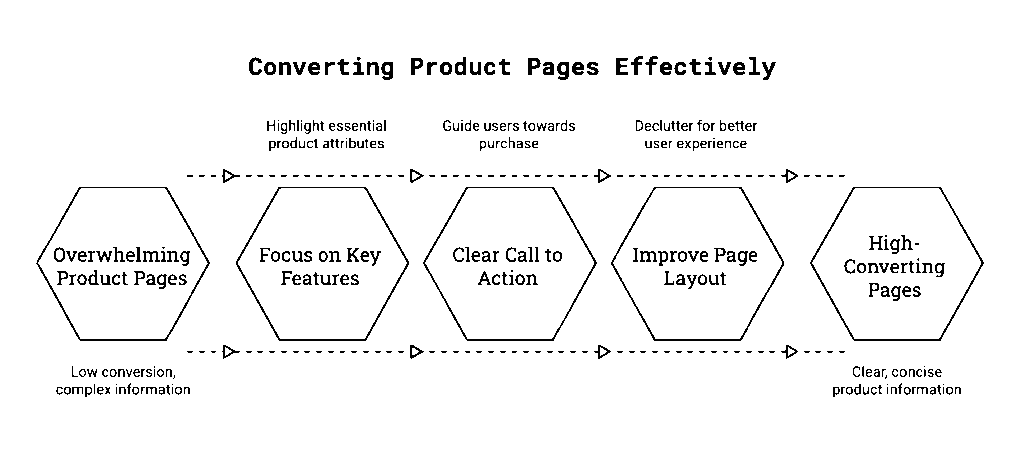
That means your Product Detail Page (PDP) isn’t a place to explore. It’s where the decision happens. But too often, PDPs try to do too much, say too much, and include too many voices—all at the cost of helping someone say yes.
This article breaks down the most common PDP mistakes I see—and what to do instead if you want your product pages to convert without overwhelming.
Mistake #1: Adding “Helpful” Features That Trigger Doubt
The Problem:
Upsells, financing banners, and warranties are designed to support the purchase—but they often backfire. Instead of building confidence, they raise new questions right as the visitor is trying to decide.
Real internal monologue:
- Do I need both items to make this work? (upsell)
- If I need financing, should I even be buying this? (financing)
- Is this going to break? Is that why I’m being offered a warranty? (warranty)
Instead of reinforcing the product’s value, these features introduce hesitation.
The Fix:
- Move these modules after the decision moment (post-ATC, in cart, or confirmation)
- If you must include them, test collapsing them behind a click or gating them based on item price
- Ask of every element: Does this help someone decide on this product—or question it?
Key Insight:
If a module shifts focus away from the product—or causes the visitor to re-evaluate their decision—it’s not helping.
Mistake #2: Treating the PDP Like a Marketing Dashboard
The Problem:
Promotional banners. UGC. Virtual try-on. “See more like this.” Financing offers. It adds up fast. And when everything is visible at once, nothing stands out.
Instead of guiding the visitor, you’re forcing them to triage.
The Fix:
- Prioritize the essentials:
- → Product image
- → One-line benefit statement
- → Buy stack (price, sizing, ATC)
- Collapse or delay less critical content unless it directly supports the purchase
- Avoid feature bloat—if it hasn’t been tested or isn’t relevant, leave it off
Key Insight:
Clarity wins. A focused PDP that guides the eye and reduces choices outperforms one that tries to say everything.
Mistake #3: Hiding the Buy Stack in the Noise
The Problem:
Visitors shouldn’t have to scroll or scan to find the price, size options, or ATC button—but that’s often what happens when the buy stack gets buried under banners, messaging, and page furniture.
The Fix:
- Visually isolate the buy stack (price, size, ATC) above the fold and make it dominant
- Avoid putting promos, financing, or reviews directly between the image and ATC
- On mobile, use sticky ATC bars to keep actions persistent
Key Insight:
If the user has to hunt for how to buy, you’re making them work harder than they should.
Mistake #4: Optimizing for Stakeholders, Not Shoppers
The Problem:
Warranties need visibility. The promo team wants their message above the fold. Marketing wants UGC. And you end up with a PDP that satisfies every internal request—except the one that matters: the customer’s.
The Fix:
- Treat every module as a test candidate—nothing gets a permanent pass
- Rotate modules based on product type, price point, or season
- Use usage data to drive decisions. No clicks? No space.
Bonus Tip: Trying to remove a cluttered module but facing internal pushback? Run a usage report. If engagement is low—or correlated with drop-off—use that data to challenge its placement. Or run an A/B test. Let the results speak for themselves.
Key Insight:
Just because something has internal value doesn’t mean it has customer value. If a feature isn’t used, it’s just decoration that costs you money.
Mistake #5: Never Testing What’s Actually Used
The Problem:
Features get added because someone read they “increase engagement.” But without actual usage data, you’re building for assumptions—not outcomes.
We’ve seen elements stay live for years with <1% interaction—because no one ever asked the hard question: is this helping or hurting?
The Fix:
- Use scroll depth, heatmaps, and interaction rates to audit feature usage
- Track post-click behavior—not just engagement
- Set rules: if a feature falls below X% interaction, it gets reviewed or removed
Key Insight:
Your PDP should help close the decision. Every feature needs to earn its place.
Product Detail Page Optimization: Suggested PDP Hierarchy
For most mid-to-high intent traffic, here’s a tested order of operations:
- Product Image (ideally zoomable or swipeable)
- Short Benefit Statement (“Crafted to last. Made to gift.”)
- Buy Stack: Price, Size/Config, Quantity, ATC
- Trust Cues: Shipping info, availability, return policy
- Secondary Content (Progressive Disclosure):
- → Warranty, Financing, Reviews, Related Products
- → UGC, Care Instructions, Tech Specs (only if relevant)
This structure preserves momentum and gives visitors just enough to act.
Final Thought
Your product detail page optimization strategy doesn’t need to do everything. It just needs to help visitors feel confident clicking Add to Cart.
Cut the noise. Guide the eye. And test until every element earns its keep.
Want to see how PDPs fit into the broader personalization strategy? Check out 5 Personalization Mistakes to Avoid and the Intent Wins Playbook. Want help auditing or optimizing your product pages? Let’s talk.