In this promo drawer case study, we replaced the site-wide top banner with an on-demand Offers drawer and saw strong results for the broad audience.
The Moment
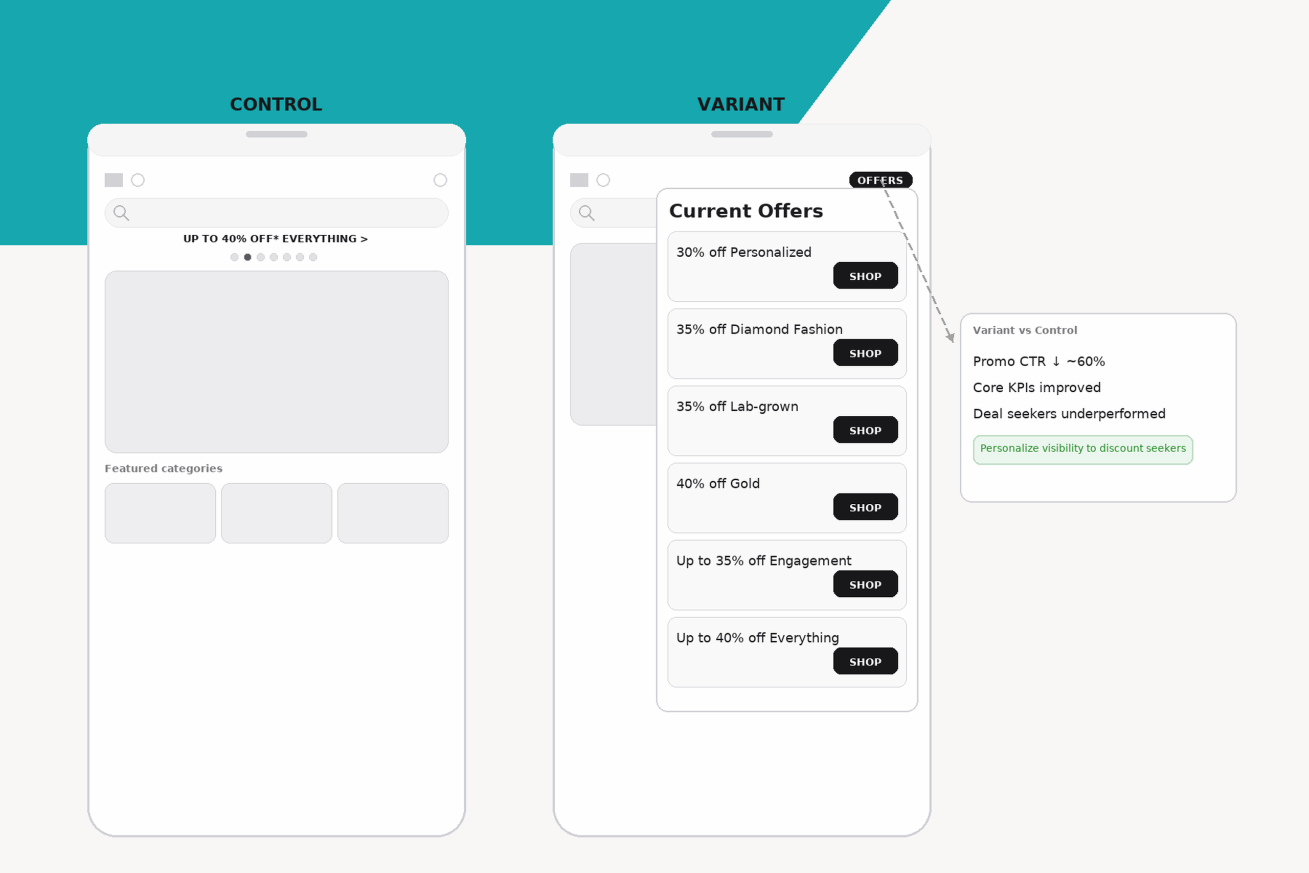
Your top-site banner ran on every page. It consumed visual space and pulled attention away from what visitors came to do. When we removed it, broad KPIs improved — but the deal-seeking subset under-performed. The banner helped some, the rest were distracted.
The bet
We hypothesized that hiding promos inside an “Offers” drawer — easy to open on demand — would keep the journey clean for most visitors while still keeping value accessible for promo seekers.
The setup
- Audience: all site visitors
- Control: always-visible top-site promo links
- Variant: no banner, on-demand Offers drawer
- Extra test: attention dot on the drawer icon
- Primary KPIs: RPV, Conversion Rate, AOV
- Diagnostic: CTR to promo content
What happened
- Promo CTR dropped approximately 60% with the drawer
- Core KPIs improved for the broad audience
- The deal-seeker subset under-performed with the hidden treatment — pointing toward the need for personalised treatment rather than a single global rule
Why it worked
Most visitors are not actively hunting for promos. They want product clarity and forward momentum. Reducing cognitive load helps. At the same time, keeping promos available on demand preserves value for the right audience.
Visual-intense banners can distract shoppers and reduce conversions — a gradual approach finds the sweet-spot between attention and friction.
Design choices that mattered
- Placed the Offers drawer in a predictable spot with clear labelling
- Avoided forcing attention with badges or dots
- Made drawer contents scannable and stable across sessions
Guardrails
- Do not hide time-sensitive offers from verified deal seekers
- Watch affiliate and clearance traffic
- Cap how often you surface the drawer proactively
What I would test next
- Personalize visibility for discount-affinity sessions
- Match drawer contents to current category or price band
- Microcopy that makes value explicit in one line
Takeaway
A quieter header and on-demand promo treatment improved results for most visitors. But deal-seekers still need a tailored approach not a one-size-fits-all banner.
This promo drawer case study proves that hidden but accessible offers can outperform always-visible banners.
Explore more results
- See how our Ways to Pay Card Case Studyachieved an +8.3% RPV lift by prioritizing payment-option clarity.
- Check out our PLA Landing Page Case Study: Turning “Near Miss” Visits into High-Value Orders to see how a PDP pivot module doubled RPV for pivot-users.
- Also read our Promo Drawer Case Study where hiding the site-wide banner and using an on-demand drawer improved RPV while reducing promo clicks.
Want to see all case studies? Visit our full case study library