Get valuable, fast feedback to increase your
eCommerce Conversions
—5 Pages in under 5 days only $500—
Pick the Pages
You pick the pages or flow to be reviewed
Expert Review
Each page will be reviewed for friction points
Action Items
Receive a prioritized list of actions items
Improve Conversions
Make the changes and increase your sales
Hurry! Only 5 UX Quickstrike available at this rate.
%
eCommerce Business Struggle to Understand Why Visitors Struggle with Their Website
Stop Wasting Marketing Dollars
eCommerce retailers have spent a lot of money on getting potential customer to their site (online advertsing, SEO and SEM). However, they haven’t spent anything on getting the customers through the funnel on the website.
Barriers to improving conversions rates are going undetected and unresolved.
The UX Quick Strike will provide massive improvements in your marketing dollars.
When you sign up
We’ll schedule a day & time to jump on a call for 15 minutes to discuss your project.
Your Quick Strike website review is designed to help you:
- improve your browse flow
- reduce shopping cart abandonment
- increase your website’s ease of use
- reduce visitors’ fear, uncertainties and doubts (FUDs)
- improve your website’s ability to convert more visitors to customers
- improve the “find-ability” of your products
Case Study
Common issues for high exit and low add to cart rates:
- Visually unappealing – Never underestimate the power of an attractive, easy- to read website compared to a cluttered eye-sore. Good design builds credibility & trust.
- No/Hidden Call to Action – When visitors make it to a product page and are in the purchase consideration phase and can’t find what to do next they exit. If the visitor has to work to find the CTA because it’s hidden, there is a huge problem.
- Not meeting expectations – Visitors do not want read every single word on your pages to understand if you can help them with their problem. It’s crucial to remove obstacles that cause them to have more questions or give up and look elsewhere.
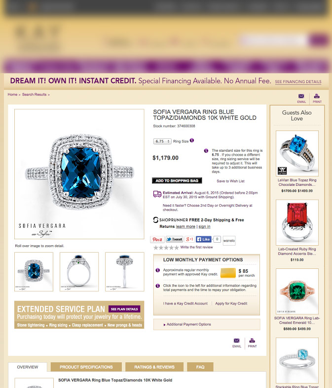
The before product page experience 3 common issues. However, top retailers and other jewelry ecommerce sites do not.
Before

The current product page has a lot of options competing for the visitors attention. Too many choices, hidden call-to-action, competing messages, no white space and clarity issues (what are the “i” that are floating around?) make this page feel like work to view.
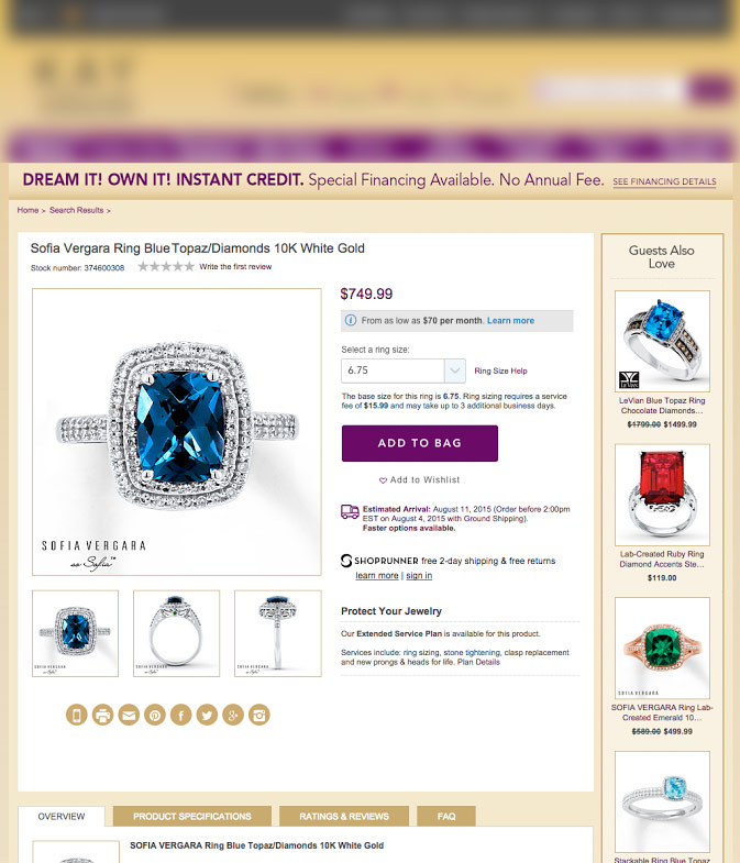
After

The proposed alternative keeps the same information on the page just improves clarity. The page feels less cluttered because the information is organized in a hierarchy (most important to least). Strong CTA stands out, additional white space,
Why It Works
Clear Path to Action
When a visitor arrives on a site that is cluttered with information, it draws attention in a number of different directions, there’s a good chance they’ll leave without ever interacting with the content.
The best eCommerce sites provide a clear path to action. That translates in well-organized product pages with whitespace, great layout with the proper content hierarchy and simple and clearly visible calls to.
The fastest way to score the most conversions is enable visitors to find the information they want with as little mental effort as possible.
Results
Scrubbed Product Page Preferred
The scrubbed version of the product page was preferred versus the current version for a variety of reasons;
1) “ADD TO BAG” button was significantly more prominent which was more noticeable and aesthetically pleasing to users,
2) The overall design and layout of content was perceived as “clean”,
3) The ring size selection box was more noticeable and perceived as easier to interact with due to the drop down and overall size,
4)The product name, stock number, and product star review location directly above the main product image was easier to consume