
The first thing you need to do when planning an A/B test is to figure out where you should start. However, finding the best A/B testing ideas can be a challenge.
A/B testing ideas can include making calls-to-action stand out more by making them bigger or changing their color, removing distractions or areas of friction in the path a visitors takes, or editing the copy of your headlines and value propositions.
Listed are the common pages and page element to look at when looking to find the best A/B testing ideas.
Common eCommerce Pages to Test
- Home Page (highly visible low priority)
- Product Pages (high value)
- Shopping Cart (high value)
- Checkout Flow (high value)
- Search Result / Category Pages
- Landing Pages – Pages that are landed on from email and/or SEM
Home Page
The main page of your website. It is often your visitor’s starting point and first impression. In many organizations this is a highly fought over page but rarely has significant impact to your conversion rates. The home page has high visibility but should be low priority on the testing scale.
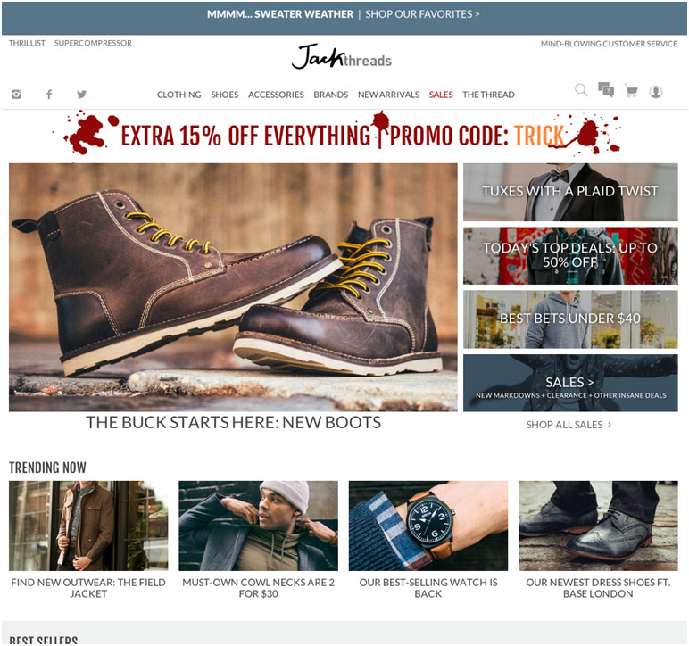
Jack Threads’ Home Page
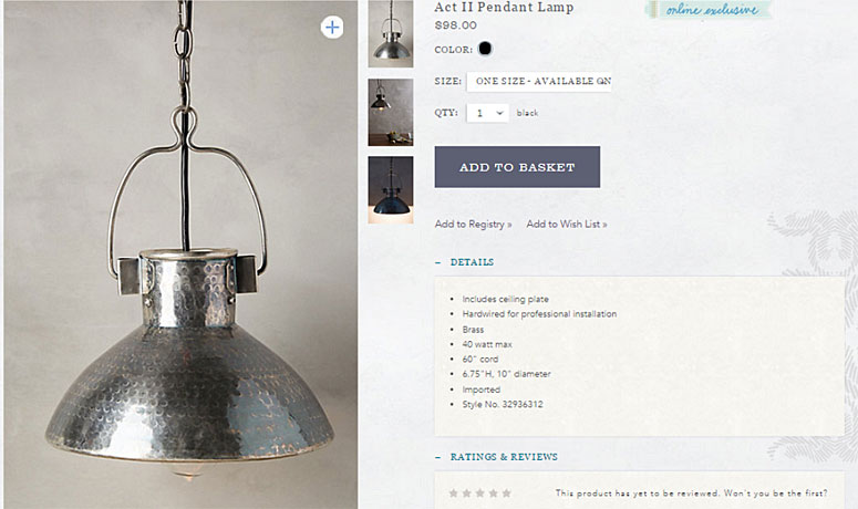
Product Page
The bread and butter of any eCommerce website. The product page may be the most important page on your website as it needs to describe the product, answer visitor questions, convince them that it is the right product for them and persuade them to add it to their shopping cart. There are a lot of different elements that can be tested on the product page.
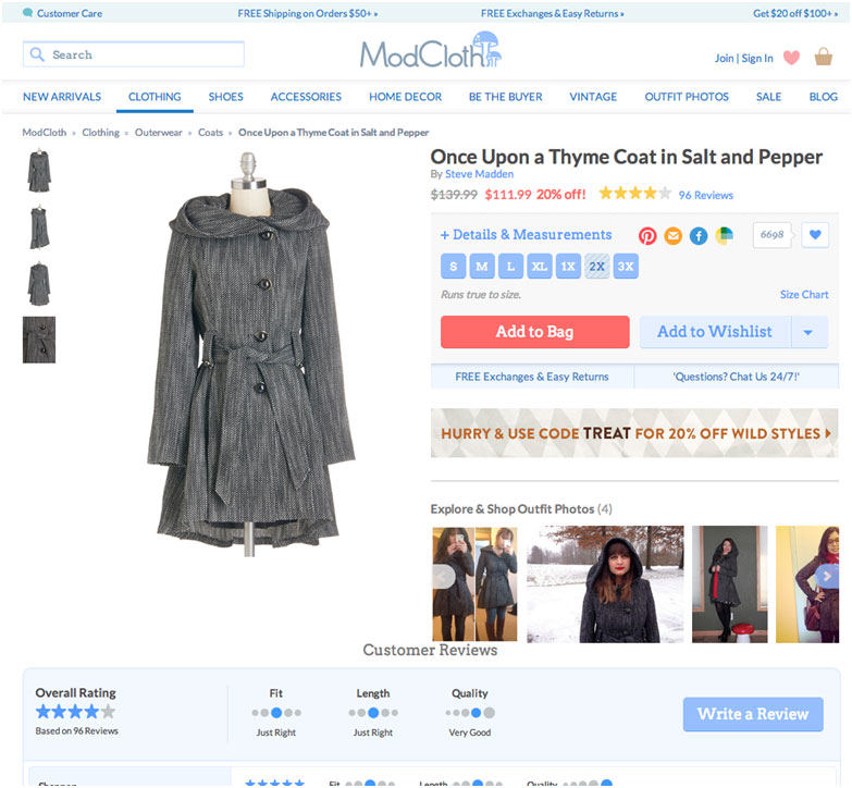
Example of ModCloth’s Product Page
Checkout Flow
The set of pages that visitors must go through after they have decided to purchase from your website. The checkout flow consists of a shopping cart, billing and shipping information, payment details, a review page and finally a confirmation page. The checkout flow is a high value page and improvements here have been shown to have immediate impact to the bottom line.
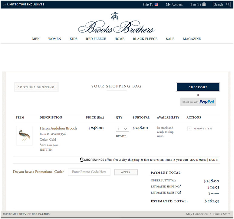
Brooks Brothers’ Shopping Cart
Common Elements to Test
It’s not a good idea to test everything on a page at once. However, there are common elements on these pages that can and should be tested. These are the elements you’ll need to modify—usually more than once.
- Headlines
- Product Titles
- Product Descriptions
- Value Propositions
- Calls-to-Action (CTAs)
- Product Images
- Marketing Promo Images
- Navigation
- Organization & Page Layout
Headlines
Yep, headlines are the big text bits usually at the top of every page. These should not to be confused with product titles.
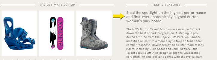
Well written headline from Burton Women’s Snowboard
Product Titles
Product titles are the big text bits usually at the top of every product page. Not to be confused with headlines.
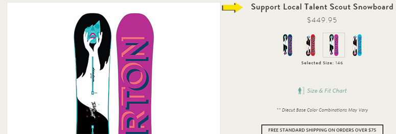
Well written product title from Burton Women’s Snowboard Product Page
Product Descriptions
The text used to describe the product while on the product detail page.
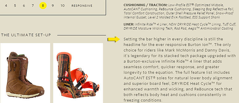
Well written product description from Burton Men’s Snowboard Boot Product Page
Value Propositions
Your value proposition is a call-out of why you are different than your competitors and more importantly why they should buy from you.
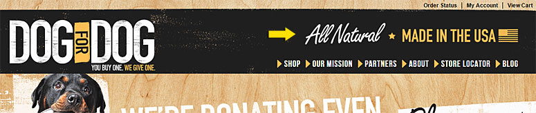
Dog for Dog has multiple value propositions shown.
Calls-to-Action (CTAs)
The primary button or link that leads a visitor to the action you want them to take—Add to Cart is the primary action on an eCommerce Product Page
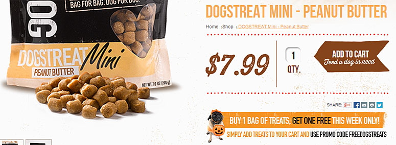
Dog for Dog uses a very large CTA that also directs the visitor’s eye
Images
Images can be a product or a marketing type image. Both image types have an effect on the visitors and should be tested—for example the number of product images, the angles of product images, the size of promotional marketing images, the placement of promotional marketing images, etc.
Anthropologie uses nice photography to highlight its products
Navigation
The navigation bar is typically located at the top of the page that contains links to other areas of your site. Often the navigation includes mega-menus that display when hovering over each primary link.
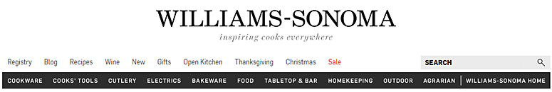
Williams-Sonoma navigation has multiple levels to better help guide the visitor
Organization & Page Layout
The organization of all the elements on a given page has a dramatic effect on how a visitor perceives the page. This organization and layout is suitable for testing.
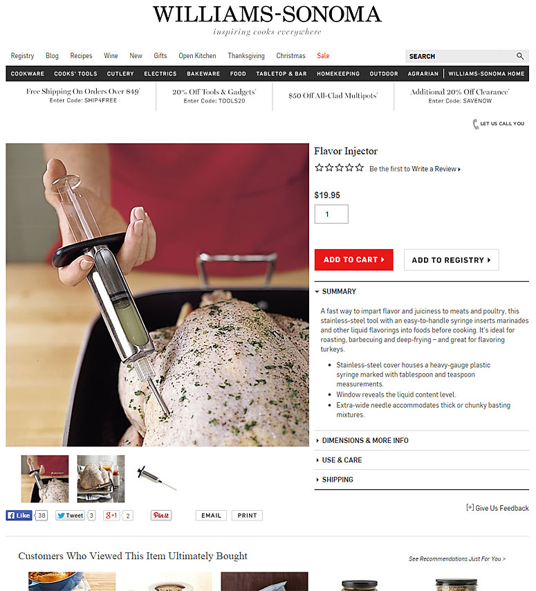
The product page from Williams-Sonoma does a good job of organizing its content and prioritizing the important information
To have the most effective A/B test it is important to look for testing ideas that will make your ecommerce site better.
How to Find the Best A/B Testing Ideas for Your eCommerce Site
- Start in your analytics tool.
- Understand how visitors are flowing through the site (funnels) and find where the drop off points are. Some common places to check—checkout flow and registration flows. If you are an eCommerce site check things like browse flows (home page, store, category and product), buy flows (product page to cart).
- Look at pages with high bounce rates
- Qualitative Voice of Customer Research (user testing)
- Watch people go through key tasks on your site. A lot of the same flows from above can be used here as well. Watch people go through your funnels keeping an eye open for problem areas.
- Start with the top visited pages
- While not as insightful as the two ideas above you can start testing elements on pages that have the most traffic.
- Competitive Qualitative Voice of Customer Research (user testing)
- Watch people go through key tasks on your competitor’s websites. A lot of the same flows from above can be used here as well. Key things to look for here are the areas that appear to be doing well in the minds of the test participant but you aren’t currently doing.
After you have gathered ideas and identified problem points start deconstructing the page and the page flow for reasons why the people are struggling. Start with high level ideas and work your way down to smaller elements such as headlines and call to actions.
Don’t start off with too much. Often times the biggest challenges is just trying to get through all the data. I recommend you pick ONE of the ideas above to get started with. For discussion let’s say you start with your analytics. This by itself may be to big, so break it down even further. It may be best to choose just one of your funnels. If you have an eCommerce site I always recommend starting closest to where the money changes hands, in this case you should start with the checkout flow.
It’s always better to get a quick win—a win should be considered valuable insight, not just a winning variation—and then move on to something larger.
Key Takeaways for Finding the Best A/B Testing Ideas
- Conducting A/B testing is better than not doing A/B testing
- Identify where you have problem pages and what ones you should test
- Identify which elements to test first
- Start with a small test and snowball your successes
Using Usability Testing to Find A/B Testing Ideas
I want to help you find the best A/B testing ideas and improve your eCommerce site. Enter your email address and get the Guide for Usability Testing, 5 Key Steps to Help Boost Your Conversions and Sales. This guide is completely free and yours to use.
Trackbacks/Pingbacks