eCommerce Review
Find Out Why & Where Your eCommerce Website Is Leaking Sales and Leaving BIG Profits on the Table
Get a Detailed Analysis and Review of Your Website That’ll Reveal Everything You Need To Know To BOOST Conversions and Sales…Right Away!

It’s Simply Shocking! The Statistics Don’t Lie…
Right now at this very moment, a whopping 97% of your ecommerce store visitors that are putting items in their online shopping cart are leaving…and not buying. That means only 3 out of 100 people who put something in their shopping cart on your website end up going through the checkout process.
Can you imagine if you improved that percentage what it would do for your sales and profits?
Not only are you losing out on massive profits, but you’re probably already wasting a lot of time and money on advertising just to get traffic to your website. It’s like continuing to fill up a bucket full of water, only to have a major leak at the bottom. It’s a total waste, and you’re paying for it in more than ways than one.
How You Can Plug The Holes That Are Leaking Profits…
Your online ecommerce business has leaks, and they need to be fixed. But before you can fix any leak, you need to find the leaks themselves. The first step is getting an accurate review of your ecommerce website by someone that’s not as close to the business as you are and knows WHAT to look for.
Right now you’re probably not aware of all the weak points in your business, and the leaks that are taking profits away from you…
That’s why you need a professional ecommerce review that’ll give you valuable insights and tips as to what’s not working, and what needs to be changed. Getting a professional website review is one of the most cost-effective and easy ways you can boost your sales and profits, as well as optimize your website for future success.
Get Real Expert Advice That You Can Put To Work Right Away…
I’ve been in the ecommerce business for over a decade now, and I’ve seen what works and what doesn’t work. My expertise has developed over time, and now I’d like to help you succeed with your own ecommerce website.
I’d like to offer you a comprehensive website review in which I’ll look at some of the most critical components to see where your website is losing profits…
I’ll also recommend what changes need to be made, as well as give you a complete report that’ll identify unique opportunities that can increase your conversion rates, how you can increase revenues, how you can eliminate visitor confusion and more.
The ultimate goal of your ecommerce review is to give you actionable advice that you can put to work right away to not only keep your website visitors engaged, but to also make them more likely to purchase from you.
Here’s Exactly What You’ll Get With Your Own Website Review
For over 15 years I’ve had vast experience in web design, user testing, and developing websites that are user-friendly. I know what makes for a high converting ecommerce website, and what doesn’t. When you hire me to review your website, you’ll be getting an expert who can quickly identify what needs to be changed to boost your sales and profits.
Your detailed website review will help you:
- Improve Your Website’s Overall Look And Appearance
- Make Your Website Easier To Use For Visitors
- Make Your Website More Trustworthy
- Convert More Visitors Into Buying Customers
- Make Your Products Easier To Find For Potential Buyers
You’ll get a complete, cost-effective plan that you can put into action right away, to get fast results!
Here’s a list of everything I’ll review in detail:
- All Navigational Pages Including: Home, Store Categories, Product Pages, Etc.
- Website Flow Including: Checkout Process, Registration, Search, Tools, Etc.
- The Structure of Your Navigation and Overall Display of Information
- A Detailed Look at Your Overall Design Aesthetics
- Analytics (Only When Available)
You’re One Step Away From Getting The Website Review You Need To Take Your Profits To a New Level…
Get your expert website review now. Choose an option below to get started with your website review.
Basic Package
- A professional eCommerce review of your site and actionable report that includes:
- A 30-minute kickoff call to understand your business, customers and goals so that I best identify the problems customers have
- Quick to implement list of ideas that, when addressed, would drastically improve the success of your site
- Assessment of your checkout flow (conversion funnel)
- A follow up call to review and ask questions regarding your website review and recommendations
- A 100% money-back guarantee: I don’t want your money if you’re not satisfied.
Enhanced Package
- A professional eCommerce review of your site and actionable report that includes:
- A 30-minute kickoff call to understand your business, customers and goals so that I best identify the problems customers have
- High Level eCommerce review
- Quick to implement list of ideas that, when addressed, would drastically improve the success of your site
- Assessment of your checkout flow (conversion funnel)
- A follow up call to review and ask questions regarding your website review and recommendations
- **Usability test and report with potential customers to get actual visitor feedback**
- A 100% money-back guarantee: I don’t want your money if you’re not satisfied.
Case Study
Common issues for high exit and low add to cart rates:
- Visually unappealing – Never underestimate the power of an attractive, easy- to read website compared to a cluttered eye-sore. Good design builds credibility & trust.
- No/Hidden Call to Action – When visitors make it to a product page and are in the purchase consideration phase and can’t find what to do next they exit. If the visitor has to work to find the CTA because it’s hidden, there is a huge problem.
- Not meeting expectations – Visitors do not want read every single word on your pages to understand if you can help them with their problem. It’s crucial to remove obstacles that cause them to have more questions or give up and look elsewhere.
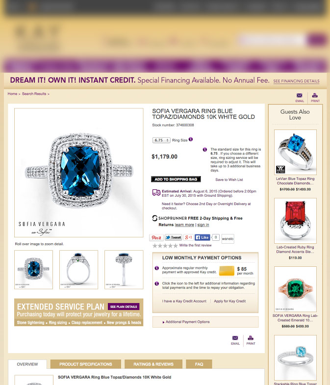
The before product page experience 3 common issues. However, top retailers and other jewelry ecommerce sites do not.
Before

The current product page has a lot of options competing for the visitors attention. Too many choices, hidden call-to-action, competing messages, no white space and clarity issues (what are the “i” that are floating around?) make this page feel like work to view.
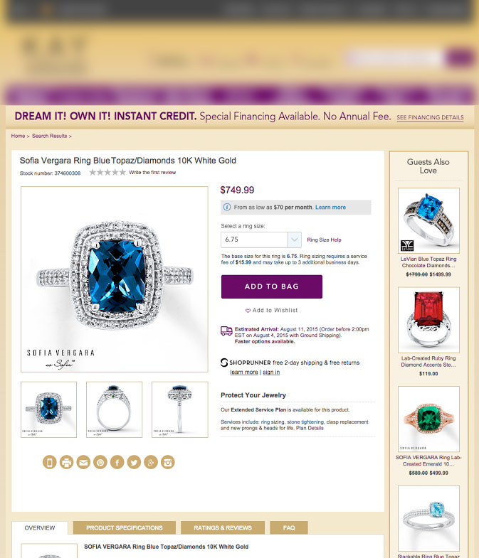
After

The proposed alternative keeps the same information on the page just improves clarity. The page feels less cluttered because the information is organized in a hierarchy (most important to least). Strong CTA stands out, additional white space,
Why It Works
Clear Path to Action
When a visitor arrives on a site that is cluttered with information, it draws attention in a number of different directions, there’s a good chance they’ll leave without ever interacting with the content.
The best eCommerce sites provide a clear path to action. That translates in well-organized product pages with whitespace, great layout with the proper content hierarchy and simple and clearly visible calls to.
The fastest way to score the most conversions is enable visitors to find the information they want with as little mental effort as possible.
Results
Scrubbed Product Page Preferred
The scrubbed version of the product page was preferred versus the current version for a variety of reasons;
1) “ADD TO BAG” button was significantly more prominent which was more noticeable and aesthetically pleasing to users,
2) The overall design and layout of content was perceived as “clean”,
3) The ring size selection box was more noticeable and perceived as easier to interact with due to the drop down and overall size,
4)The product name, stock number, and product star review location directly above the main product image was easier to consume

